Hello from the Critique Club!!
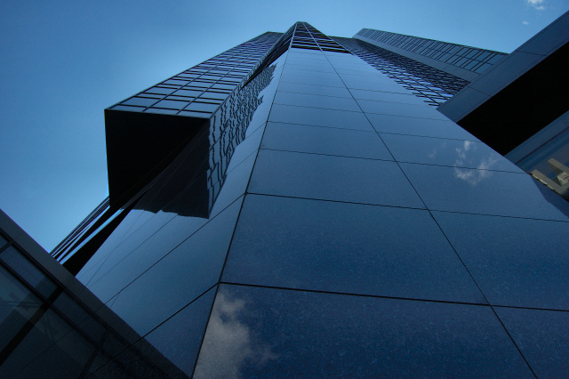
This is a very strong image, the angle is dynamic and creates great negative space with the sky. The shape of the building makes for a nice subject. Many of the technical apsects are spot on.
I think what hurts this picture is the color and contrast. Correct me if I'm wrong, but it looks like this building was in the shade. The contrast is very low and doesn't allow for thet "pop" that people always look for. I have always found that neutral light creates more dull pictures. If you use the bright sun to light your subject your contrast will always be better. The reflection is only of the sky and doesn't allow for any interesting elements.
I love the shot, and think that with more dynamic colors and contrast, it would be very stong.
--James B. Hale |







 Add photograph to your favorites
 Add photographer to your favorites

 Photographer found comment helpful.


