This is great - I love the texture! People obviously got hung up on some of the technical imperfections here as it should have finished higher, IMHO...
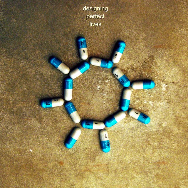
This is only marginally related, but I just read an article saying that the company which produces Prozac got a license to sell it as dog medicine, to treat 'separation anxiety' which occurs if the owners leave their pets by themselves for a long time. :) It's a strange world we live in.
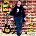
I really liked this one. Gave it an 8. Think it should have done much better. The name is perfect for the picture. I think it brings a mood that really captures the title geniunely.
I love everything about this entry except the placement of the text. Ah, hell, I'll give you a 10 anyway! Great band name, and it's perfectly illustrated in the photo. Plus, the photo itself is a joy to look at.
This is a very cool idea and image ... reminds me of something the talking heads would do. Focus is too soft on the pills, or I would have scored this higher. 7 as it is.
One of a very small number that actually looks to me like a REAL album cover. I'm a bit distracted (only on second glance) by the rectangular dark spot in the right center but it's not a big deal. 10. My second favorite in this challenge.
More of a "project" than a "band," designing perfect lives is the brainchild of Jimsus Calibray, one of the new breed of laptop musicians. Named after his mother's two biggest heroes, Jimmie Dean and Jesus, Jimsus was obsessed with Kurt Vonnegut novels. Finally, he decided to write the soundtrack to Cat's Cradle. When he ran into copyright troubles, he decided to write his own Kurt Vonnegut novel about a society controlled by pills.
Finding the writing of novels a tremendously tedious task, he ended up skipping that step and going directly to the soundtrack, which also became the name of his "band"
Love the color choices you made here - especially the brown toned background. The shape and use of the capsules is also really visually pleasing and engaging.
A couple suggestions - The blue and white tones in the pills looks a little over saturated. Also I thinkt he font size of the title needs to be a bit larger - like the choice of font though.






 Add photograph to your favorites
 Add photographer to your favorites

 Photographer found comment helpful.


