Author Thread
Post actions
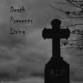
HAHAHA I loved this, Gave it an 8 and hey look you are part of the top 100 so that's a good thing. I would say that the border messed you up here. It's a tad too busy IMO.
Comments Made During the Challenge
Post actions
I absolutely love this. It's just so random and funny.
Post actions
Post actions
Looks more like a postcard than an album colour. But I like the colours and textures.
Post actions
Too funny! And cute, kinda. Nicely composed.
Post actions
ha ha lovely, crop is a little tight, but neat idea, 7.
Post actions
very cute and fun shot, 8
Post actions
where's your DPL?, Of course I don't know if it's mandatory that it be on there...(?)
Post actions
Hilarious. I would have employed the square crop to add a sharper competitative edge. Bump.
Post actions
How cool is this shot. Great title and capture and I do not care that it is not an album square crop. + 9
Post actions
This actually made me laugh!
Post actions
Nice idea, good shot, but shouldn't be an album cover in square format? Would also have been better to include the bands name on the cover. The frame ditracts, too.
Post actions
Ha. Nice one. I would have left out the border if I were you. Looks fine but makes it look a little less like an album cover.
Post actions
Love the shot and the titles, but with the framimg, it looks more like a photo than an album cover. Would have been a bit more effective if the shot were more shaped like an album or CD cover...more square? But, just my opinion.






 Add photograph to your favorites
 Add photographer to your favorites

 Photographer found comment helpful.


