| Author | Thread |
|
|
12/19/2007 04:58:52 PM |
|
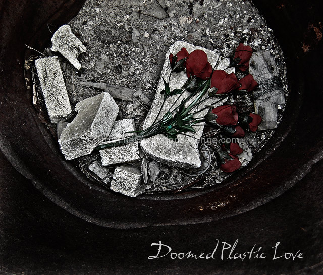
I love that seletive desaturation.... it works so well here, with those sombre, lovely reds against the rough, dark textures. It creates an intensely moody atmosphere. |
|
 Photographer found comment helpful. Photographer found comment helpful. |
|
|
05/21/2007 11:48:47 PM |
Originally posted by UrfaTheGreat:
Originally posted by purpleflutterby13:
Cool image. The colours do look doomed, and I like the composition. I'd imagine the flowers would look even more interesting if you set them on fire :) |
hehe.. that was the idea.. but this was near a lot of electrical wiring.. and my gran would have killed me if I burnt her plastic roses.. ^_^ |
just ignore her... she's a pyro!!! hahaha |
|
| Photographer found comment helpful. |
|
|
05/21/2007 05:24:23 AM |
Originally posted by purpleflutterby13:
Cool image. The colours do look doomed, and I like the composition. I'd imagine the flowers would look even more interesting if you set them on fire :) |
hehe.. that was the idea.. but this was near a lot of electrical wiring.. and my gran would have killed me if I burnt her plastic roses.. ^_^ |
|
Comments Made During the Challenge  |
|
|
05/20/2007 02:23:46 PM |
|
Cool image. The colours do look doomed, and I like the composition. I'd imagine the flowers would look even more interesting if you set them on fire :) |
|
| Photographer found comment helpful. |
|
|
05/20/2007 08:23:57 AM |
|
Not square... should be square IMHO. Besides that, this looks a bit too busy. |
|
| Photographer found comment helpful. |
|
|
05/20/2007 02:42:09 AM |
|
Awww... so sad! I like the font choice - fits in with the mode of the shot I think. |
|
| Photographer found comment helpful. |
|
|
05/20/2007 01:34:31 AM |
Bobby, don't bring me plastic roses
I'm never gonna put them where my nose is
Bobby, I'm not in love,
Bobby, I'm not alone.
Call me...
on a plastic telephone.
10 |
|
| Photographer found comment helpful. |
|
|
05/17/2007 03:01:15 AM |
|
unfortunately, those bricks seem to be reflecting a lot of light and take attention away from the roses. nice use of selective desat. |
|
| Photographer found comment helpful. |
|
|
05/16/2007 07:29:45 PM |
|
The image doesn't really grab me, but I think the idea was good. The album title is very cool. |
|
| Photographer found comment helpful. |
|
|
05/16/2007 03:19:23 PM |
|
Love the shot - textures are awesome. Styrofoam? Well designed. |
|
| Photographer found comment helpful. |
|
|
05/15/2007 09:07:27 AM |
|
Like the picutre and editing alot, but not so much the title. |
|
| Photographer found comment helpful. |
|
|
05/15/2007 08:54:21 AM |
|
Really like the colour in the otherwise monochromatic scene. The crop on the top of the circle works well allowing for the text bottom right. An evocative image that well matches the title. |
|
| Photographer found comment helpful. |
|
|
05/15/2007 04:49:51 AM |
I smell a ribbon winner.
This is fantastic. The ash and roses coupled with the title offer a very compelling concept. 10+ |
|
| Photographer found comment helpful. |
|
|
05/14/2007 11:01:28 PM |
|
Very great, I love the bit of tinting in the barrel. |
|
| Photographer found comment helpful. |
|
|
05/14/2007 01:41:10 PM |
|
Love this shot. Nice job. |
|
| Photographer found comment helpful. |
|
|
05/14/2007 05:32:27 AM |
|
I like the effect of desaturating the photo and leaving the roses red. It has that wonderful grungy look. One of my favourites. |
|
| Photographer found comment helpful. |
Home -
Challenges -
Community -
League -
Photos -
Cameras -
Lenses -
Learn -
Help -
Terms of Use -
Privacy -
Top ^
DPChallenge, and website content and design, Copyright © 2001-2026 Challenging Technologies, LLC.
All digital photo copyrights belong to the photographers and may not be used without permission.
Current Server Time: 06/29/2026 03:16:03 AM EDT.