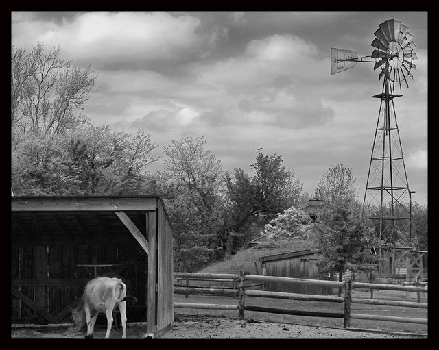
I love the lightness of the tones here. Composition is great and draws the eyes to all the right places. I'm wondering how this photo would have looked with a white frame. The black seems a little heavy for the airiness of the image. It's great that you didn't go overboard with the contrast. I find that hard to do sometimes - so I'll take this as an inspiration to try to create that kind of lightness in a photo soon.
This has fantastic composition. A lot of really interesting elements in this photo. I agree that some localized dodging and burning, especially in the center greys, would pop this even more.
Day 13 experiment with Charlene's (dcnfarrell) very cool looking image...(thanks for letting me give it a try)
just made a few small changes....not to say it's better ..(because there is absolutely nothing wrong with your picture).....just different....i increased the contrast by setting the white and black points in levels, the burned the clouds slightly and dodged the cow and shelter....then slight sharpen (usm), lumminosity channel only...mine is below:
The processing here is really nice, and I like the tones and overall appearance. I agree it's a bit tight on the bottom where the poor cow has lost a foot, but the overall silvery look is quite appealing.
This is a beauty in itself. I like the placement of yur subjects in either directions. The choice of B&W is awesome and the presence of windmill givves your shot an extra dimension.
Rajeev
I really like this alot Charlene...the compositioin and squarish crop are fantastic....I do think it needs a tad more contrast....maybe some localized doging and burning?? would you mind if i gave it a shot??




 Add photograph to your favorites
 Add photographer to your favorites

 Photographer found comment helpful.


