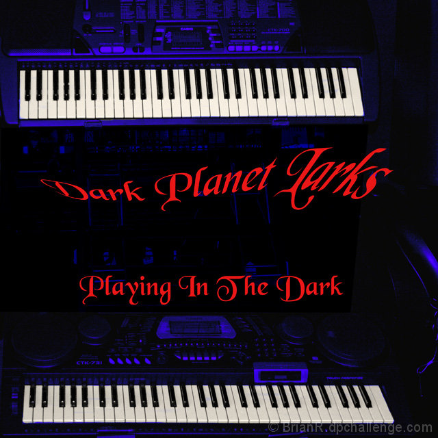
Thanks To Ultra Music, Hervey Bay, for allowing me to photograph 2 of their electronic band organs for this challenge, the organs were displayed on the one stand that worked well with what I had in mind.
The three word name was a bit more of the thinking tank, as DPL are not the easiest letters for a Band title, the theme of the cover helped being a DARK effect, from this PLANET and LARKS meaning songsters.
Adjust tone and crop in Raw.
PhotoShop
Remove distractions
Levels
Gradient map
Selective color
Sharpen
NI
Add Text
Levels
Brightness/Contrast
Save for web
Statistics
Place: 120 out of 153 Avg (all users): 5.0952 Avg (commenters): 4.0000 Avg (participants): 4.8481 Avg (non-participants): 5.2443 Views since voting: 798 Views during voting: 330 Votes: 210 Comments: 7 Favorites: 0
Well, I like this a lot, and I like the bold red font centered between the keyboards. I think it's an excellent album cover, and IMO it should have scored higher.
Nice eye-catching design with the keyboards and nice colors as well. A bit torn on the curvature of the upper text - maybe have that really curved and run across the upper keyboard?





 Add photograph to your favorites
 Add photographer to your favorites

 Photographer found comment helpful.


