| Author | Thread |
|
|
09/11/2007 12:07:20 AM |
|
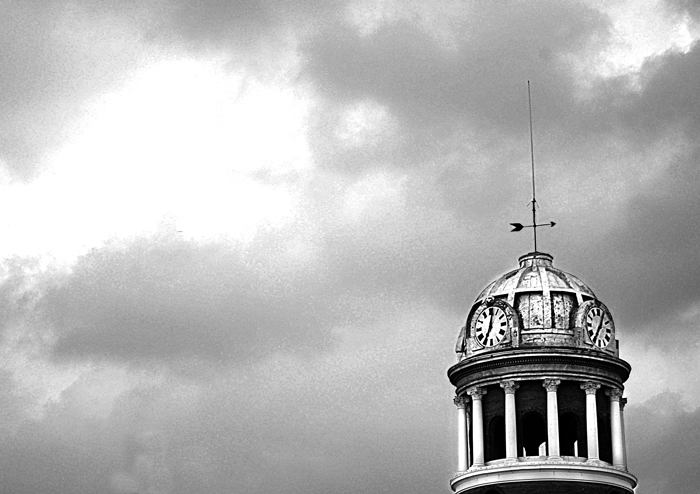
I really like the composition of this photo. I am not a big grain person, but it's not too bad here. I love your use of negative space. |
|
 Photographer found comment helpful. Photographer found comment helpful. |
|
|
05/09/2007 11:02:04 PM |
Love the composition, and how you used the rule of thirds for positioning the tower in this image.
I like it a lot..... |
|
| Photographer found comment helpful. |
|
|
05/09/2007 02:58:02 PM |
|
the contrast on the tower is awesome, but do not like the grain so much on the clouds. Now all you need is a big ol' lightning bolt from the sky hitting that rod - that would be cooool. |
|
| Photographer found comment helpful. |
|
|
05/07/2007 01:28:32 PM |
|
The contrast on the tower itself (particularly the columns) is great! The grain ain't so bad... |
|
| Photographer found comment helpful. |
|
|
05/06/2007 07:07:35 PM |
|
Very newspaper photo feel. The grain bothers me alot. I think less sky may be in order for this shot, or maybe you could compress the sky a little to retain the white area, but a little closer to the dome. |
|
| Photographer found comment helpful. |
|
|
05/06/2007 06:01:51 PM |
|
Nice composition elements and for me the grain works well. I love the empty space on the left, though the whites of the cloud in this area seem a touch blown out (which may have been the intention, in which case apologies) |
|
| Photographer found comment helpful. |
|
|
05/06/2007 08:07:40 AM |
|
Great clocktower, like the graininess of that, but the overblown sky isn't so flattering. |
|
| Photographer found comment helpful. |
|
|
05/05/2007 11:24:06 PM |
|
I like the minimalism. Nice use of negative space. The touch of grain works well. |
|
| Photographer found comment helpful. |
|
|
05/05/2007 11:08:49 PM |
|
This would look a lot better were the tower vertically aligned with the edge of the frame. The processing is a love/hate thing. The big blotch of white in the sky isn't really working for me, but overall I kind of dig what you've done with the shot in post. |
|
| Photographer found comment helpful. |
Home -
Challenges -
Community -
League -
Photos -
Cameras -
Lenses -
Learn -
Help -
Terms of Use -
Privacy -
Top ^
DPChallenge, and website content and design, Copyright © 2001-2026 Challenging Technologies, LLC.
All digital photo copyrights belong to the photographers and may not be used without permission.
Current Server Time: 07/23/2026 04:06:00 PM EDT.