| Author | Thread |
|
|
05/14/2007 06:02:27 PM |
|
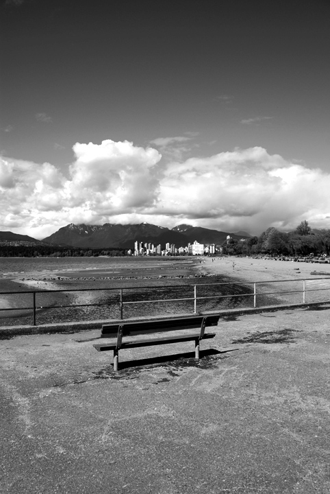
Beautiful tonal range and I like how the big city and bench have been compressed between the sky and pavement. |
|
 Photographer found comment helpful. Photographer found comment helpful. |
|
|
05/06/2007 07:32:05 PM |
I like it. The contrast is great and the lighting too. The one thing I struggle with on B&W is getting the clouds to look impressive but you seemed to have nailed that here. Is there a special method to getting the clouds to look like this? Or is it just a matter of contrast and brightness balance?
But to answer your question: I like your picture :) |
|
| Photographer found comment helpful. |
|
|
05/05/2007 04:23:11 PM |
The b/w conversion is good. I wish there were more blacks but the scene really didn't lend itself to that. Compositionally, this is rather dull. You've chosen a portrait format which doesn't really go well with all the horizontal lines in the photo. You'd normally want to focus on creating as much depth as possible in this format and the fencing in particular is a barrier to that.
To pick up what Art said the photo does lack a subject but it doesn't mean it needs to have a person in it. What I think the problem is the clouds are "acting" as that subject as that's the first thing that my eyes gravitate to when I look at this. That is because it's the brightest thing in the shot and also has strong contrast. This is probably one of those photos where burning would help redirect that focus to what you want it to be and may also help you get more blacks into the shot which is what I love about b/w.
Message edited by author 2007-05-05 16:24:33. |
|
| Photographer found comment helpful. |
|
|
05/05/2007 04:21:32 PM |
First of all, welcome to the world of post-processing. You'll love it...and hate it...all at one time.
Not bad, especially for your first. I see that the image is in grayscale. Did you just desaturate it, or did you spend some time with a particular conversion method? The reason I ask is that it looks a little washed. You do have a great foundation to start with, but I think it could use a little more contrast. I spent a minute fiddling with it and came up with this.

I added a soft light layer, filled it with red, desaturated and adjusted it with a channel mixer layer than added a slight curves adjustment for some contrast. I also added a small border, as I stand on that side of the never-ending border argument. Let me know if I can help you with anything I mentioned, and good luck! |
|
| Photographer found comment helpful. |
|
|
05/05/2007 04:12:53 PM |
|
Good tones & contrast. Seems to be lacking in subject. Someone sitting on the bench perhaps? How about Forrest Gump? :) |
|
| Photographer found comment helpful. |
Home -
Challenges -
Community -
League -
Photos -
Cameras -
Lenses -
Learn -
Help -
Terms of Use -
Privacy -
Top ^
DPChallenge, and website content and design, Copyright © 2001-2026 Challenging Technologies, LLC.
All digital photo copyrights belong to the photographers and may not be used without permission.
Current Server Time: 06/12/2026 09:17:12 PM EDT.