| Author | Thread |
|
|
05/05/2007 08:09:08 PM |
|
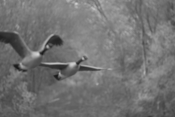
Normally I don't look for an impressionistic painting look in a photograph but you have captured one here - and without doing any heavy post-processing to achieve this effect which is impressive. I do like how you have captured this nature scene as a quick impressionist painting. What I don't like is that some of the contrasts and tones are flat. I think bringing up some of the tones and contrasts in this "photo painting" would really make it stand out. Also, lovely capture of the geese in flight among the natural setting of the trees. Very pleasing to the eye and a soothing scene to look upon. And yes, it would have been nice to capture the full wing instead of it being cut out BUT you work with what you get (and impressionist painters sometimes had to work quickly to capture the light before it faded and changed the mood and feel of the scene) |
|
 Photographer found comment helpful. Photographer found comment helpful. |
|
|
05/05/2007 05:36:06 PM |
|
I'm not a big fan of things soft and OOF because I think these old eyes need to see sharp things in pics. Are these Canadian geese? I would love to have seen them a little clearer and the rest of the pic in blur. I am not sure if I have my story right but I thought that these geese always travel in pairs - don't they mate for life? The fact that you have two in this pic kind of supports that story (for me anyway lol). |
|
| Photographer found comment helpful. |
|
|
05/04/2007 08:59:54 PM |
|
Despite the impressionistic focus, you did catch some nice detail. It could even use a bit more processing along the fine art style to create a very artistic piece. |
|
| Photographer found comment helpful. |
|
|
05/04/2007 12:48:12 AM |
|
i think i understand what you were going for but I have to agree with mak that the focus is bothersome,perhaps if you had spot sharpened you could have kept the look you like with a little more broad appeal. |
|
| Photographer found comment helpful. |
|
|
05/03/2007 08:09:31 PM |
The softness is appealing even though it is mostly out of focus.
I still like the misty feeling it gives us..... |
|
| Photographer found comment helpful. |
|
|
05/03/2007 05:43:40 PM |
Yeah the lack of wing completion is an issue.
But more unfortunate is how blurry it is, there is nothing in focus at all, and because of the lack of strong contrast, not so pleasant to view. |
|
| Photographer found comment helpful. |
|
|
05/03/2007 01:53:39 PM |
I agree it is a bummer about the cut off wing, but other than that I really dig this. Black and White Photography had an issue out a few months ago centering on photogs in Hungary - some of the most interesting work was purposely out of focus and blurred (yours is not blurred) and I found it both captivating to look at and very inspiring.
Only thing that holds this shot back for me is it could use just a bit of a contrast kick to provide some tonal separation. Other than that, I think this is a real winner. |
|
| Photographer found comment helpful. |
|
|
05/03/2007 01:09:11 PM |
This shot would get totally spanked in a challenge.
but you know that!
And at least the backgroubd is out of focus too.
if that was in focus and the birds weren't, then it would look really bad
But I'm willing to accept that you like it and that's fine by me. |
|
| Photographer found comment helpful. |
|
|
05/03/2007 12:35:04 PM |
I guess at heart I'm a real focus freak when it comes down to it, and the idea of everything out of focus, yet still recognizeable (so much so that many people's -including my own- first reaction will be, "It's blurry!") is new to me. What I'm trying to say is that in my view up to now, if something is presented out of focus, it needs to be recognized as being out of focus on purpose. The idea of purposefully straddling the line between on purpose and by accident hadn't occurred to me. And at first view, to me this looks more like a "by accident". Control-freak-speak :)
I'm not sure, mk, why do you like it?
|
|
| Photographer found comment helpful. |
|
|
05/03/2007 11:49:22 AM |
|
i love the abstract feel the blur and soft focus give to this picture. |
|
| Photographer found comment helpful. |
|
|
05/03/2007 11:07:31 AM |
|
The soft focus does not bother me here - I think it's just out of focus enough that it works. However, I do think upping the contrast would improve this. It feels a little flat to me. |
|
| Photographer found comment helpful. |
|
|
05/03/2007 10:56:02 AM |
|
Hey, looks like summin that came out of my Holga. I mean that as a compliment. |
|
| Photographer found comment helpful. |
|
|
05/03/2007 10:44:34 AM |
|
I'm torn between liking the paint feeling and not. I think the geese being focused and the background blurred might have worked better. Not that that auto focus works everytime. :) I also agree that color might work a bit better for the effect. With the b/w there sin't a whole lot of contrast here. |
|
| Photographer found comment helpful. |
|
|
05/03/2007 10:27:00 AM |
|
I know what you mean, I constantly miss getting the whole bird in the frame. IMO it seems kind of flat. I think the Painted look, looks good sometimes but more for color photo's. |
|
| Photographer found comment helpful. |
|
|
05/03/2007 10:20:23 AM |
Originally posted by MAK:
Sorry maybe its me but it seems totally OOF (out of focus) if that was your intention then i feel it was too much, I understand that some people like to get a softness by being slightly OOF but on my monitor it looks quite a way off.. I do apologise. |
Definitely not you...it's very out of focus. :) It appeals to me despite that (and maybe because of it) but I know that it won't be everyone's bag (and perhaps nobody else's). No need for apologies, I much prefer honest feedback to insincere praise.
Message edited by author 2007-05-03 10:25:48. |
|
|
|
05/03/2007 10:11:01 AM |
|
Sorry maybe its me but it seems totally OOF (out of focus) if that was your intention then i feel it was too much, I understand that some people like to get a softness by being slightly OOF but on my monitor it looks quite a way off.. I do apologise. |
|
| Photographer found comment helpful. |
Home -
Challenges -
Community -
League -
Photos -
Cameras -
Lenses -
Learn -
Help -
Terms of Use -
Privacy -
Top ^
DPChallenge, and website content and design, Copyright © 2001-2026 Challenging Technologies, LLC.
All digital photo copyrights belong to the photographers and may not be used without permission.
Current Server Time: 07/01/2026 06:35:02 PM EDT.