| Author | Thread |
|
|
05/03/2007 08:52:59 PM |
|
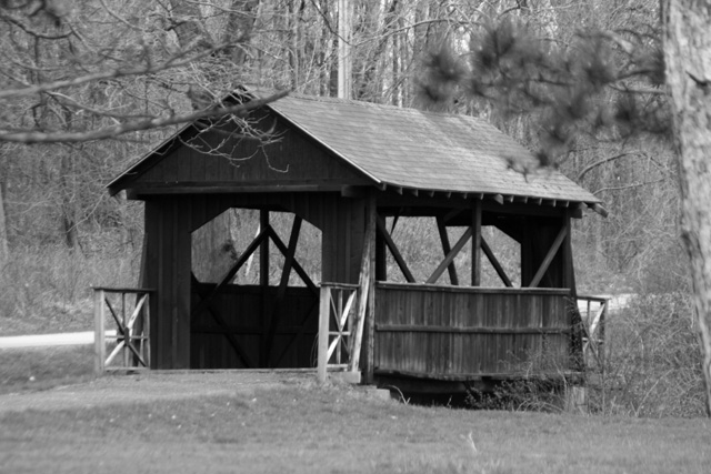
Simple covered bridge... I think you should have had lots of fun in post with this. Maybe try it super high contrasty and see how it looks... Might surprize ya. |
|
 Photographer found comment helpful. Photographer found comment helpful. |
|
|
05/03/2007 10:30:03 AM |
This looks like somewhere I would really like to be!. . . and photograph! It's a great photo for black and white since you have the complete range of tones, and has great focus and detail.
I think Michelle may be on to something about shifting the composition to eliminate the branches. That might make it even better.
|
|
| Photographer found comment helpful. |
|
|
05/03/2007 09:21:45 AM |
deb - go back to the original thread - where people were signing up to do this. I had asked what processes people follow to convert to black and white and I got some great ideas there. I have since noticed a difference in my black and white pics. I have taken plenty of pics with more gray tones and I am using this challenge to move past that.
This is a great idea for a shot. The tree branches are a distraction for me and I don't know if this would have been possible, but get down closer to the ground and try taking the pic that way. Or get closer and change the focus. Speaking of focus, this looks great! |
|
| Photographer found comment helpful. |
|
|
05/02/2007 10:36:27 PM |
|
My first impression is that there may be too much going on in this photo to lend itself well to b&w. All those textures can get really lost without color to differentiate them. The bridge is very dark, which is a good starting point. I think some more gradiation in midtones would help, but this may not be the right photo for it. As a photo, though, the composition is quite strong. |
|
| Photographer found comment helpful. |
|
|
05/02/2007 07:59:34 PM |
|
Your blacks are really black, which is good. Needs a bit more highlight and graduated midtones to make a great b&w. Not sure this one really lends itself to that. Still, composition is very nice and the gates at the front have the best tonal quality for b&w. |
|
| Photographer found comment helpful. |
|
|
05/02/2007 05:43:18 PM |
|
Sweet image with the framing in front - love those kind of bridges. What a wonderful find. |
|
| Photographer found comment helpful. |
|
|
05/02/2007 04:30:42 PM |
|
Nice subject...I think anything older makes for a great topic for B&W. Especially older buildings. IMO though this seems slightly OOF. |
|
| Photographer found comment helpful. |
|
|
05/02/2007 07:09:31 AM |
|
Great building, hope you explore it some more. Think it would have benefitted from stronger contrast in my opinion. |
|
| Photographer found comment helpful. |
|
|
05/02/2007 02:58:26 AM |
Some suggestions:
When photographing a subject, pay very close attention to what is, and isn't, in your view. The OOF foreground elements here (the branches), are very distracting, and easily avoidable. Take some time to wander around and find an area that provides a good, clear, unobstructed view of your subject.
MK has some very good points regarding B&W conversion. I second them.
Also, compositionally, I'll have to disagree with sherpet, partly due to the fact that you've chosen a spot with distractions in the way, but also partly because this subject doesn't really work well in a centered composition. I'll explain why IMO:
The path leading into the bridge disappears on the other side. You have brush and bramble there that abruptly cuts off your line. Because of this, I'd have tried to find a way to get more of the leading path into the shot, giving you negative space to lead into the bridge, in an off-centered composition. This way, you don't worry about having uninteresting brush, you give more dynamics to the shot, and you give a reason for the eye to follow the scene.
Lastly, sharpness is a small issue as well. A light pass with USM at or around 0.3 radius, and 150 or so amount (tweak as needed), would help that.
(EDIT: Ooops, mk beat me to the composition idea already, missed that. But I hope I've expanded on it well enough.)
Message edited by author 2007-05-02 02:59:12. |
|
| Photographer found comment helpful. |
|
|
05/02/2007 12:20:05 AM |
"then a bunch of stuff that I had to undo"
I know the feeling. :)
Two comments I'd make here - one, the b/w conversion seems a little flat. Simple desaturation can do that. If you want to go that route, you might play a little with levels or curves. But you might also consider doing your b/w conversion with the channel mixer where (imo) you have a little more control.
Regarding the composition, I think you can crop off the area to the right of the barn, making your subject a little less dead center. Neat subject, though! |
|
| Photographer found comment helpful. |
|
|
05/02/2007 12:14:14 AM |
|
A great composition here, done very well in black and white..... |
|
| Photographer found comment helpful. |
Home -
Challenges -
Community -
League -
Photos -
Cameras -
Lenses -
Learn -
Help -
Terms of Use -
Privacy -
Top ^
DPChallenge, and website content and design, Copyright © 2001-2026 Challenging Technologies, LLC.
All digital photo copyrights belong to the photographers and may not be used without permission.
Current Server Time: 07/16/2026 11:39:28 AM EDT.