| Author | Thread |
|
|
05/12/2007 11:43:57 PM |
Greetings from the Critique Club
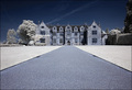
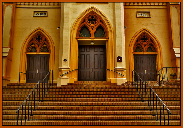
Lovely colors in this image. YOu may have started out with washed out colors, but by the time you finished with this image, those colors were just fine.
Your composition works well, and if you didn't correct for perspective, your lens worked for you. I see little distortion and everything looks "normal" (whatever that means).
In other words, I'll just say, congratulations on your excellent score for this piece and keep up the good work. |
|
 Photographer found comment helpful. Photographer found comment helpful. |
Comments Made During the Challenge  |
|
|
05/07/2007 10:53:16 PM |
|
| Photographer found comment helpful. |
|
|
05/05/2007 04:57:40 AM |
|
I think I'd like a crop on either the stairs or either the main entrance (with ornaments). Nice image though! -7- |
|
| Photographer found comment helpful. |
|
|
05/04/2007 11:35:17 AM |
|
I like the rich tones, and the border enhances it very nicely. Excellent example of symmetry. |
|
| Photographer found comment helpful. |
|
|
05/02/2007 05:15:53 PM |
|
| Photographer found comment helpful. |
|
|
05/02/2007 03:33:24 PM |
|
Really nice shot; I like the choice of subject, and the perspective/composition are dead on. I wish the light was a little more flattering; some sunlight would really give this a little extra impact. |
|
| Photographer found comment helpful. |
Home -
Challenges -
Community -
League -
Photos -
Cameras -
Lenses -
Learn -
Help -
Terms of Use -
Privacy -
Top ^
DPChallenge, and website content and design, Copyright © 2001-2026 Challenging Technologies, LLC.
All digital photo copyrights belong to the photographers and may not be used without permission.
Current Server Time: 06/29/2026 12:28:57 AM EDT.