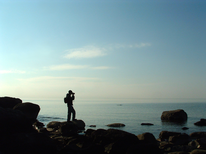
hmmm... I think I would have liked this better in black & white. There's so much negative space & the hint of blue in that space only makes you wish there was more color. I like that the title cues me into the location - but only cause I grew up on Lake Superior. It seems to me that the subject is not the lake, but the person & therefore a title referencing him or what he is doing - something to bring more story to the image - would have been more fitting.
These are just my humble opinions, though! Good luck...
BTW, which area of the big lake is this? |





 Add photograph to your favorites
 Add photographer to your favorites


 Photographer found comment helpful.