Greetings from the Critique Club
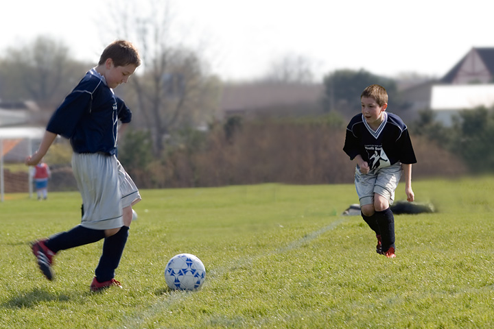
Interesting idea, "competing against yourself", and you went to a lot of trouble to edit this image.
Strong points: The kid looks great, good smile, great postures. The blurred background has just enough detail to give context without becoming intrussive. The colours are gentle and good to look at. The composition is fine.
Possible weaknesses: The second pasted in shot (your son on the right) looks very much pasted in. It is not organic with the field, it looks like he's floating there, not really part of the image. However, you did a great job of editing out the other people you mention in your notes.
Overall: This is two nice images of your son playing soccer, but as a composite it needs more work to really work. Also, even though the image might mean a lot to you and your son, usually family pictures do not have a strong meaning to other viewers, especially viewers who will spend only a couple seconds voting on each image.
I hope this helps. If I can be of further help, please let me know.
~Ursula
|