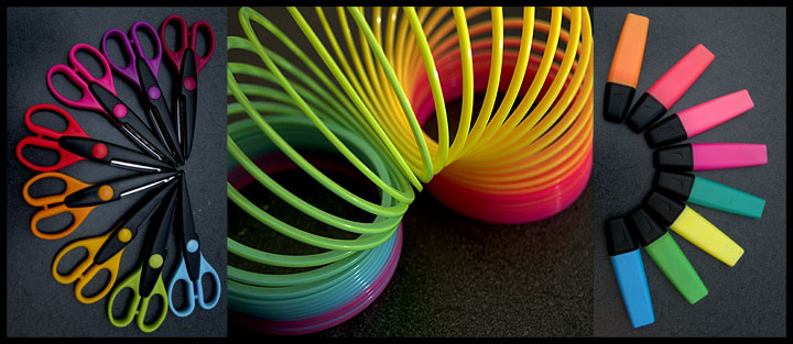
First impressions were "wow, look at the color!" The wow factor really helps this shot score well. The images work well together even though the items in each picture only marginally relate. Obviously the tie in is the array of colors. The markers/highlighters and the sissors go together but on further reflection, the slinky is slightly out of place. Unfortunately, the slinky really is the focal point of your piece and you probably got your inspiration from that and worked in the other items for the color. Don't know how much better this might of scored if all the items more clearly related. I'm slightly distracted by the lighting only in that the outside photos were shot at a different angle and therefore reflected light differently than the center shot. This subtle change of lighting would have been less noticable or distracting had the frames been seperated from each other a bit by a black border perhaps. Obviously all three shots can be very different lighting but in this shot the effect appears that you wanted the same lighting but didn't get it right in all three shots. Overall, your lighting is really good. I particularly like the highlights on the middle shot. I notice from your voting that you got a good number of 9's and 10's but NO 1's or 2's. In other words NO ONE thought the shot sucked. That's remarkable because there are always trolls out there! I pretty much only have good things to say about your photo...it's a shame it didn't place higher. I imagine if you look at the competition there isn't much that seperates you from many positions higher. Great concept and excellent execution!





 Add photograph to your favorites
 Add photographer to your favorites

 Photographer found comment helpful.


