DPChallenge: A Digital Photography Contest You are not logged in. (log in or register
 
Challenge Entries
This image is not a part of any challenge.
Portfolio Images
This image is not part of a public portfolio.
Miners Kitchen
Miners Kitchen
BAMartin


Photograph Information Photographer's Comments
Date Uploaded: Apr 28, 2007

Viewed: 282
Comments: 4
Favorites: 0

N/A

Please log in or register to add your comments!

AuthorThread
06/30/2007 10:45:44 PM
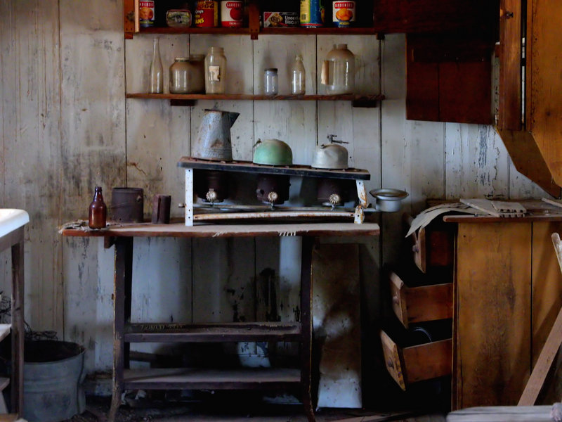
Interesting shot. It's hard to imagine what it must have been like to live in this kitchen and prepare meals there!

Photographically, this shot could do with some boosting. First, the WB is off. Auto WB has picked sunny WB, but indoors, this gives a blue cast to the image. One fix as suggested is to throw away the colours, and go BW (I've done this to rescue some truly horrible colours), but I feel the colours add something to this image, so keep them if you can. You can try adjusting the white balance in PS, but I can never get great results from a simple WB slider, and I prefer to use the colour balance, and adjust the RGB seperately. This image needs some boosting in the reds, and possibly a slight reduction in blues.

The lighting is a little flat, with the windows on both sides being quite low, and no overhead lighting. A little bit of bounce flash on the cieling would help to lift the lighting.

For PP, some simple curves adjustments might help (brightness/contrast/shadow/highlight points), but you can't beat a good dodge/burn for an image like this, and maybe even a little HDR treatment (there's many ways of doing this).

PM me if you would like me to do a sample edit.
  Photographer found comment helpful.
06/23/2007 10:10:06 PM
i think this is a "ok" photo, but it could look great in BW. nice work.
  Photographer found comment helpful.
06/23/2007 06:01:33 AM
Great composition and I love how you have captured the light shining on the main subject. I think you could probably crop the white table just peeking in on the left of the frame and possibly the piece of wood sticking in on the right hand side as these give the image a little too much of a 'busy' feel. Other than that lovely colours and editing is good :o)
  Photographer found comment helpful.
06/22/2007 08:25:26 PM
Here's my 2 cents/pence:

I like the image, it looks like someone just left the room. However, I think it needs a little work to get the most out of it as it looks a little flat right here- maybe a little USM on it and a little boost in contrast would help it along a bit to make it live a bit more as the colours on the wood look a little bland, also there is a lot of shadows which probably harbour some detail that cannot be seen.

I do like this picture but with a bit of work, this could be great. Good job.
  Photographer found comment helpful.


Home - Challenges - Community - League - Photos - Cameras - Lenses - Learn - Prints! - Help - Terms of Use - Privacy - Top ^
DPChallenge, and website content and design, Copyright © 2001-2024 Challenging Technologies, LLC.
All digital photo copyrights belong to the photographers and may not be used without permission.
Current Server Time: 04/19/2024 05:35:05 PM EDT.