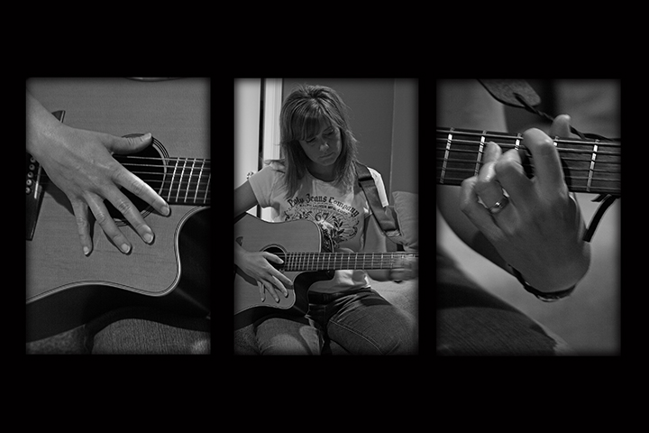
Nice images but the last pic lets this series down and maybe a bit more variety in the pics would help. Images look a little grey rather than black and white though.
Hey, that's almost exactly the same concept I started with! Mine evolved a good bit, but isn't doing too well, hope yours does better! Anyway, I like the hand poses and the symmetry. I wish the right panel were either sharper or the fingers had more motion-blur. Also, the super-thick black top and bottom frame doesn't work for me. But otherwise good!





 Add photograph to your favorites
 Add photographer to your favorites


 Photographer found comment helpful.


