| Author | Thread |
|
|
05/04/2007 01:00:21 AM |
|
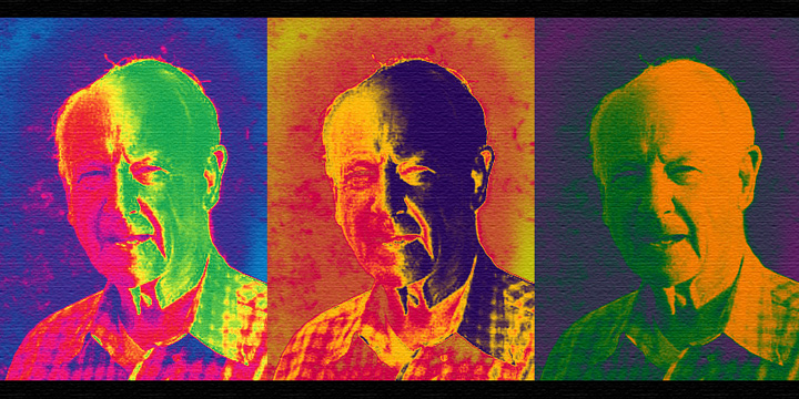
This is so cool, really neat, and so strong, not only in color, but also in its depth of character of the man, you call Dad..... |
|
 Photographer found comment helpful. Photographer found comment helpful. |
|
|
04/28/2007 11:24:34 AM |
|
this is beautiful and wild. changing the order of photos, as catherine suggests, would balance it too much, make it too safe. |
|
| Photographer found comment helpful. |
|
|
04/28/2007 11:14:45 AM |
|
Andy Warhol would be proud. This is really COOOOOL. |
|
| Photographer found comment helpful. |
|
|
04/28/2007 09:57:42 AM |
|
Julianne, very interesting choice of pop art type photos to illustrate your pop (no pun intended). My one suggestion - I would switch the photo on the far right to the center, as I think it would give better balance to the triptych. The reason is that it is the most focused of the three (I understand they are all the same photo but that you processed them differently) and catches the eye the most quickly. |
|
| Photographer found comment helpful. |
|
|
04/28/2007 08:54:37 AM |
|
I understand art therapy - I use it with jewelry. I think it is quite radical to use pop color with someone who does not look pop art. oh - lol even tho he is your pop. The three panes side by side, with no borders in between, is cool. Fun picture! |
|
| Photographer found comment helpful. |
|
|
04/28/2007 03:15:39 AM |
|
I like it - works very well in my opinion! |
|
| Photographer found comment helpful. |
|
|
04/28/2007 02:28:37 AM |
|
Aw.. this is really emotional. Great colors, too. |
|
| Photographer found comment helpful. |
Home -
Challenges -
Community -
League -
Photos -
Cameras -
Lenses -
Learn -
Help -
Terms of Use -
Privacy -
Top ^
DPChallenge, and website content and design, Copyright © 2001-2026 Challenging Technologies, LLC.
All digital photo copyrights belong to the photographers and may not be used without permission.
Current Server Time: 07/24/2026 08:50:46 AM EDT.