| Author | Thread |
Comments Made During the Challenge  |
|
|
05/08/2007 03:15:00 PM |
|
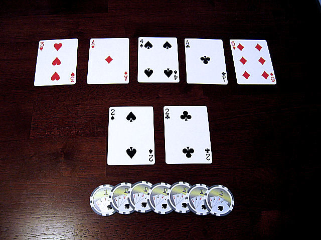
I like the idea, and the composition is fine, if a little pedestrian; the focus is sharp, but what damages this for me is the uneven exposure and flash highlight on the table. I feel that the photograph would have benefitted from being cropped in closer, perhaps with a tighter arrangement of the cards. |
|
|
|
05/05/2007 04:13:53 PM |
|
Sorry, this is just boring. |
|
|
|
05/04/2007 12:13:06 PM |
|
digital jaggies hurt this one ... composition is a bit too centered also |
|
|
|
05/04/2007 08:54:25 AM |
|
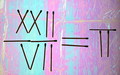
Well lit and good, sharp focus. I'm not sure about the tie in between the cards and the number pi besides the obvious numerical reference. The circular chips are by far a stronger tie in with the callenge topic and would have been better if they played a larger role in the composition. I do love the way you've captured the rich color and texture of the wood, though. |
|
 Photographer found comment helpful. Photographer found comment helpful. |
|
|
05/03/2007 10:51:53 PM |
|
concept is interesting. some distracting glare in bottom right I wonder how this would look with a hand holding the cards |
|
|
|
05/03/2007 12:28:55 PM |
|
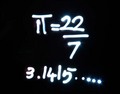
...well. It's 2.1416 if you round it. It's actually 3.14159... It really confused me at first. |
|
|
|
05/03/2007 11:19:03 AM |
|
i don't get this and the angle isn't very creative, but nice try! |
|
|
|
05/02/2007 04:36:47 AM |
|
Nice concept. Lighting is distractingly uneven across the shot. |
|
Home -
Challenges -
Community -
League -
Photos -
Cameras -
Lenses -
Learn -
Help -
Terms of Use -
Privacy -
Top ^
DPChallenge, and website content and design, Copyright © 2001-2026 Challenging Technologies, LLC.
All digital photo copyrights belong to the photographers and may not be used without permission.
Current Server Time: 06/28/2026 11:21:19 PM EDT.