| Author | Thread |
|
|
05/04/2007 12:34:34 AM |
Hey there from the Critique Club
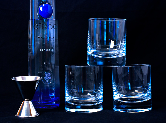
Camera Work/Technical: Spectacular! Your focus is spot on, making this one nice and crisp. You also captured a great intensity in the blues really making this one pop.
Lighting: I think that your lighting is the strength of this capture. The only flaws I can see with the lighting is the hot area on the shot measure and a small outline of the softbox on the top glass. Even still, I really like the lighting that you created here. Perhaps a polarizer would have toned down the reflections just a hair.
Composition/Content: This is where I think the voters hit you. The composition is a bit cluttered, and it feels too deliberate. I like the stacked glasses, but the chopped bottle seems out of place. I think that sliding the bottle behind the glasses, moving the shot measure out and opening up the zoom a little to include the entire bottle
My Opinion: This one seems like it scored about where it should have as it is. You have a very nice idea and you did a fantastic job with your lighting. With some small changes in the composition, this one would have surely bumped close to a 6.
Thank you for the opportunity to provide a critique on your entry,
Eric |
|
 Photographer found comment helpful. Photographer found comment helpful. |
Comments Made During the Challenge  |
|
|
04/24/2007 10:10:52 PM |
|
Yeah! Now we're talking! Im liking the blue lighting. |
|
|
|
04/24/2007 08:42:01 PM |
|
I like the composition, color and lighting. |
|
| Photographer found comment helpful. |
|
|
04/24/2007 03:42:12 PM |
|
| Photographer found comment helpful. |
|
|
04/24/2007 12:48:44 AM |
|
refections on glass are hard to do. Maybe a polarizer would have toned them down 6 |
|
| Photographer found comment helpful. |
|
|
04/23/2007 01:16:12 PM |
|
I like your idea and the simplicity. Just a few reflections too many. |
|
| Photographer found comment helpful. |
|
|
04/23/2007 09:25:16 AM |
|
my kind of dinner what time? |
|
|
|
04/23/2007 12:31:30 AM |
|
I'm eatin' at your house. Nice lighting, hard with super reflective stuff. I think I'd prefer it if you didn't cut off the top of the bottle. |
|
| Photographer found comment helpful. |
Home -
Challenges -
Community -
League -
Photos -
Cameras -
Lenses -
Learn -
Help -
Terms of Use -
Privacy -
Top ^
DPChallenge, and website content and design, Copyright © 2001-2026 Challenging Technologies, LLC.
All digital photo copyrights belong to the photographers and may not be used without permission.
Current Server Time: 06/28/2026 06:36:15 PM EDT.