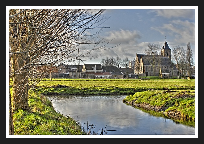
Very nicely tone-mapped. I like this very much. The composition and colors are fantastic. That said, I would change a couple of things. It looks like the tone-mapping has really grayed up your clouds. I'd like to see some brighter whites in them. Also, there is such a large amount of detail in this photo. I think it would have really benefited from being larger. Either lose the border, or use the full 720 (I'm not knocking your score because of the size...just an observation).
Nice PP, but compared to a lot of other entries here, the subject just isn't "WOW" enough. Unfortunately, I'm in a similar boat in this challenge. =) Best of luck!
I like the lighting and color tones. It gives the impression of an old had colored b/w image.Looks like a vintage postcard >>I get the feeling that I could turn it over and on the back would be a postmark from 1903.
Seems to be a Flemish landscape. The post processing is well visible, but this halo gives a kind of aetheral mood.
IMO the border takes too much space, is too contrasted, don't fit with the photo, is distracting.
Shame there is this modern building visible near the church, but to hide it you should have take the shot in the middle of the river :-D.





 Add photograph to your favorites
 Add photographer to your favorites


