| Author | Thread |
Comments Made During the Challenge  |
|
|
04/24/2007 03:29:43 PM |
|
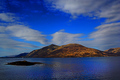
It could be so beautiful, but it's soo small... |
|
|
|
04/24/2007 02:41:22 PM |
|
I really, really like this one...but why so small? The colors seem so rich and vivid, and the scene so very relaxing. I sure should like to see this in more detail. |
|
|
|
04/24/2007 07:05:52 AM |
|
|
|
04/23/2007 11:24:42 PM |
|
nice colors, wish it was bigger |
|
|
|
04/23/2007 03:03:34 PM |
|
I think the border is a little distracting |
|
|
|
04/23/2007 12:34:14 PM |
|
I love the colors on this. I want to know where it is! |
|
|
|
04/23/2007 05:14:42 AM |
|
Very nice colors but why so small in size? |
|
|
|
04/22/2007 11:04:20 AM |
|
Wish this was a little larger in size. |
|
|
|
04/21/2007 09:03:50 AM |
|
I like it. Would look better larger. |
|
|
|
04/21/2007 06:04:46 AM |
|
Love the strong color and sharpness..... |
|
|
|
04/20/2007 09:02:00 PM |
|
I assume it's concrete, but the coloring and shine make it appear very formal |
|
|
|
04/20/2007 03:05:41 PM |
|
Incredible. The colors and the mood work great together. Great presentation. |
|
|
|
04/20/2007 10:26:15 AM |
|
Something seems weird about this photo. It seems like it is a tv or something. Hopefully not, because it is a nice photo. The colors are too vivid for my taste, but it has an interesting composition. |
|
|
|
04/19/2007 01:46:54 PM |
|
The size of the photo is going to really hurt the score. But, other than that it looks great. |
|
|
|
04/19/2007 01:21:16 PM |
|
Small size and a large and somewhat distracting black border seriously hurts the appeal of this otherwise wonderful scene. |
|
|
|
04/19/2007 12:40:12 PM |
|
|
|
04/19/2007 12:22:27 PM |
|
Black border takes away from what appears to be an excelent photo but its had to see the image. |
|
|
|
04/18/2007 11:07:40 PM |
|
There is something wierd about this, almost looks like you took a picture of a tv. |
|
|
|
04/18/2007 10:59:09 PM |
|
Looks almost too graphically rendered, rather than photographic... tough call with expert editing. Otherwise nice colors and framing. |
|
|
|
04/18/2007 10:42:20 PM |
|
|
|
04/18/2007 03:51:03 PM |
|
The colors and composition are beautiful. 9. |
|
|
|
04/18/2007 03:24:37 PM |
|
looks like it is quite a dramatic shot, but you should have taken advantage of the larger size allowance to size this bigger. less of a border would also help give the viewer/voter more of the picture to look at. |
|
|
|
04/18/2007 08:56:01 AM |
|
Like the colors and the black border, but the picture is kind of small.... |
|
|
|
04/18/2007 01:21:31 AM |
|
very nice. One of the best yet. |
|
|
|
04/18/2007 12:46:03 AM |
|
This looks like a really good picture, but it's so small I can't really tell. |
|
|
|
04/18/2007 12:23:07 AM |
|
Why the small canvas? I do like the composition of the shot. If you shot RAW you could have tried to fix the vignetting if you didn't intend it. 6 |
|
Home -
Challenges -
Community -
League -
Photos -
Cameras -
Lenses -
Learn -
Help -
Terms of Use -
Privacy -
Top ^
DPChallenge, and website content and design, Copyright © 2001-2026 Challenging Technologies, LLC.
All digital photo copyrights belong to the photographers and may not be used without permission.
Current Server Time: 06/27/2026 07:14:24 PM EDT.