Hey Gayle,
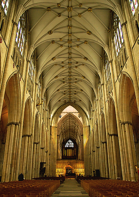
IMO, this is a definite improvement over the original. It for sure is straighter (if you look at the centerline on the ceiling, now it is right on the 'y' in 'My Home' on the menu bar, and in the original it is between the 'm' and 'y'), doesn't seem like a lot, but it is noticeable :-) I much prefer it brightened up, although I can see what Marigold is saying about the lighting, and agree to some extent. I think either backing off a touch from here, or a little tweaking of levels or curves, like a little boost to mid-tone contrast could actually accentuate that nice natural light. (I sent you a pm about this). I do like it better brighter, like this version. I think this version or close to it, (brighter and no tilt) could of easily bumped your score up close to or over a 6) Of course, this is all just my opinion, and really all comes down to personal taste :-) |