| Author | Thread |
|
|
05/07/2007 04:25:19 PM |
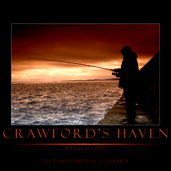
nice shot - the colors are awesome. I've been out to the end of the ogden point breakwater many a time. I'm not crazy about the border, and agree with Art's comments. the typography could be stronger. Also, your horizon is slightly crooked - it needs to be rotated clockwise. I've fiddled with it a bit to try and clean the text up (I didn't rotate it).
 |
|
 Photographer found comment helpful. Photographer found comment helpful. |
|
|
04/08/2007 02:40:53 AM |
tip tipt tip for ya - (my opinion of course) - the image is beautiful. I'll comment on it in the other version. For the poster or print here - the title should not exceed the edges of the image itself and the words below the line should be more evenly distributed / spaced vertically - that would make it look MUCH more polished and professional, IMO. Look at those motivational posters or travel posters as an example of the kind of guidelines they follow regarding the borders, titles, subtitles, etc.
edit: Oh, and shave off some of that top border - it should be the same width as the left and right.
Message edited by author 2007-04-08 02:41:43. |
|
| Photographer found comment helpful. |
Home -
Challenges -
Community -
League -
Photos -
Cameras -
Lenses -
Learn -
Help -
Terms of Use -
Privacy -
Top ^
DPChallenge, and website content and design, Copyright © 2001-2026 Challenging Technologies, LLC.
All digital photo copyrights belong to the photographers and may not be used without permission.
Current Server Time: 06/18/2026 01:30:16 AM EDT.