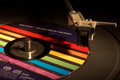
The blown out background is a little overdone, and you've clipped portions of your subject with whatever you used to get the effect. Subject is strong, however. Although the composition seems a little too straightforward.
Would have prefered it without the hand, but still a very awesome image. I think I only have that criticism because the rest of the elements fit together so beautifully that I'd like to focus on them. That they fit together so nicely is very cool.






 Add photograph to your favorites
 Add photographer to your favorites


 Photographer found comment helpful.


