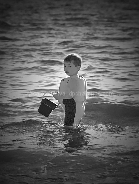
Learning how to use masking layers. Getting better than my last attempt.
In a regular challenge, w/o the vignette this would get not attention. In a regular challenge, this would do ok because i have the vignette effect. In a free study challenge, this will get hammered because I am no photoshop master, there is no mountain (but I do have water!), and it is in black and white so the the thumb nail image may not be all that exciting. (Let's not forget that the title is more than one word!) Plus people will not like the grain on his face and arms and I am not really sure how to get rid of it. It's a personal photo, so no matter what score I get, it will never be good enough ;o)
Crop
curves
b/w contrast
layer mask for gradient fill
resize
sharpen
Score predict: 5.062802 E-4
Statistics
Place: 506 out of 561 Avg (all users): 4.8298 Avg (commenters): 5.3333 Avg (participants): 4.7449 Avg (non-participants): 5.0233 Views since voting: 967 Views during voting: 217 Votes: 141 Comments: 6 Favorites: 0
I thought this photo should have scored higher. The traditional flower shots and lovely scenery shots are really nice, but there are not a lot of "deep" meanings to a lot of challenges and that seems to lend itself to a lot of boredom. I LOVE the idea that you've done something different, other than a "technically perfect" shot or one of the traditional compositions. We need more depth and artsy styles and particularily shots that have meaning, even if they are not "technically perfect" shots!
vignetting is way overdone. the child is clearly the focal point. he's the only thing in the photo. the last thing he needs is more emphasis. nice capture, though. 5
Right then, joke's on me as I now have to plough through 564 images and bump them all (yes, all of them) up. There'll be a third run through for fine tuning. It's day two now and I'm running late, sorry.
I think this is worth 6 right now. It'll be worth a lot more to a certain someone in years to come...
This would be a great snapshot to scrapbook for memories, but the compsotion is too centered and the contrast is too dull. It kind of gives off a muddy appearance like a poorly exposed b/w film shot from years ago.





 Add photograph to your favorites
 Add photographer to your favorites

 Photographer found comment helpful.


