converted from raw
played with white balance to get cooler tones
increased saturation
increased contrast
levels
slight crop
minor cloning to remove glare spots
burn on small glare spot on railing
resize
added border
Statistics
Place: 362 out of 561 Avg (all users): 5.4036 Avg (commenters): 5.6250 Avg (participants): 5.3659 Avg (non-participants): 5.5116 Views since voting: 1272 Views during voting: 243 Votes: 166 Comments: 15 Favorites: 0
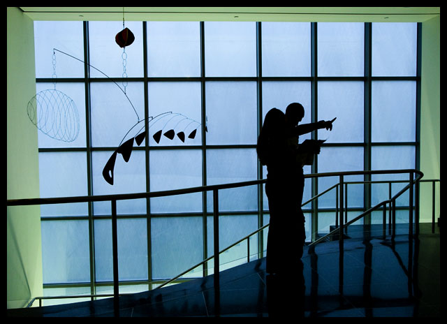
Positives: Well concieved and simple idea. In photography, simple and clean is GOOD! Framing with the window as the main background feature works well for the silhoutte. Technicals are good.
Technicals: Sharpness is good, composition and framing to the rule of thirds to highlight your main silhouetted subjects are good. Including the kinetic art for balance on the left side is a nice touch and easily helps the viewer to know where the image was taken.
Edge framing is a little "ragged". The closeness of your subjects makes them hard to distinguish.
The Challenge: Voters expect and demand only the highest quality images with significant "wow" factor in Free Study challenges to give an above average score. Yours lacks the "wow" factor voters were looking for and that is why it got a below average score from those given in that challenge, though it pretty much matches the overall DPC average score given. In others words, voters think it is an average picture.
Suggestions: Though the framing is generally good the left edge is a little unevenly balanced against the right edge. You might consider cropping out just a little off the left side to achieve better balance with the right side.
If you could reshoot you might consider having your models stand further apart so their silhouettes are distinct and recognizable as separate individuals.
Probably the most significant thing to try to increase viewer interest and add "wow" factor is to better highlight the light rays emerging from the lower stairwell on either side of the frame. That lighting is a significant feature of the composition that is begging to be brought out more. Dodge and burn and/or specialized color post processing could be used to good effect to draw attention to that lighting and get a higher score.
I quite liked this during voting and still do. Love the natural framing/construction of the photo provided by the window, and the silhouettes. Also think the color serves this very well with its gentle blues and greens.
Having the couple looking away from the Calder makes this even more interesting. Hope they noticed it before going to the gift store. The pointing hand adds a very dynamic element. Good eye.
Lots of potential here. What keeps me from scoring higher is that the two people are a blob. If they were distinct, well defined silhouettes, I would like it a lot more.
Right then, joke's on me as I now have to plough through 564 images and bump them all (yes, all of them) up. There'll be a third run through for fine tuning.
Clever candid. Make them window bars vertical (the vertical ones) 6
I like the apparent confusion in this and the realtionship bewtween the order of that mobile/sculpture and the figure's apparent disorientation. An original and fine image
8






 Add photograph to your favorites
 Add photographer to your favorites

 Photographer found comment helpful.


