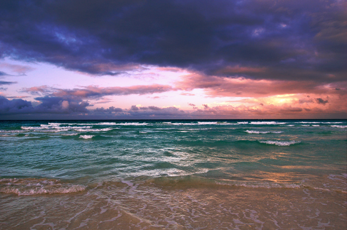
Most impressive, I think. I wonder if something like this would be validated here, if you entered it in an advanced challenge. It's clearly more powerful and dramatic than the original.
First thing I always do is make a copy of the background layer. I usually use adjustment layers, which wouldn't change the image layer, but just in case I want to go back and do some sharpening, etc, that'll make sure I don't do the changes to the original image.
The first step in my workflow is almost always levels. I have seen so many wonderful shots that I think fall just a little short because of needing a levels adjustment. (Curves also works, but I'm not as comfortable with it because I do not know it as well.)
Hm, okay. Auto levels gives a weird purple orange color. Cool but not what I want to go for.
To adjust manually. A trick I use is to pull the arrows on the left and right in towards the middle, stopping where the black in the graph starts. But for your image that's a little too extreme, so I'm going with 44, 1.00, 240.
Then I hide that layer and do another adjustment layer for levels, this time seeing what happens when I adjust the channels separately. What I do is red: 49, 1.00, 204 / green: 39, 1.00, 255 / blue 50, 1.00, 223. I compare the two levels layers and like the second one way more. However I'm going to do another levels layer to bump up the contrast. 17, 1.00, 239 (to all channels at once).
I then delete the original, unused levels layer.
Selective color to lighten the whites
I want the whites on the waves to be whiter. I use a selective color layer, choosing whites from the drop-down menu and sliding the black value all the way down to the left. That's nice for the waves, but it whitens the sky a lot. I want to remove the effect from the sky altogether, so I use a mask. The selective color layer already has a mask so I don't need to click the little square with a circle in it at the bottom of the layers window. With the white box to the immediate left of "selective color" clicked, I then use the selection tool to select the sky, and use the paint fill tool to fill in the color black. This masks off the effect, leaving the sky unchanged by the selective color edit.
I duplicate the selective color layer because I want the whites to be even brighter. But I go back to the first selective color layer and play around with the blending modes - I really like "hard light" because it seems to give the ocean so much depth. But it's too extreme, so I take the opacity down to 45%.
Sky
Now the sky looks a bit too subtle in comparison to the ocean. So I'm going to put an adjustment layer on, changing no values, but just changing the blending mode afterwards. I pick selective color just because, and mask off the water using the same technique as before. What I choose is linear burn at 38%.
Levels again
I then need to adjust the levels again so I do another layer at 6, 1.00, 235. I also feel that the blue in the clouds is a bit clashing with the other colors. I do another selective color layer, this time picking the blues, and changing cyan to -20, yellow to -10, and black to +18. I like how it seems to blend better with the pinkish colors. I don't need to do a mask since the water is green, not blue.
Correcting overprocessing
Okay, I think I'm done, but something just seems a tad bit off and I think I'm feeling like it's a bit overprocessed. So I take the copy of the background layer and drag it to the top. I then adjust the opacity to zero. This is what it is like with my edits. I then start moving the opacity back up. What this does is effectively minimizes the impact of all my edits. I stop at 17%, and then check how it looks by hiding and un-hiding the layer to compare. I like how it looks so I keep it.