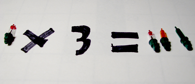
I'm sorry, I thought of a better title too late (after the submission deadline): Multiply Light Sources -- it would have helped make the point more obvious for some of the hurried voters.
There is a grid in the background that is barely discernable. Not sure if you intended for that to show up or not. The plugs on the bulbs are to dark, can't make out any detail. The reflection on the '1' on the right looks the best. I would have liked it if was larger on the frame. A little fill light on the right side would have helped.





 Add photograph to your favorites
 Add photographer to your favorites


 Photographer found comment helpful.


