Greetings from the Critique Club
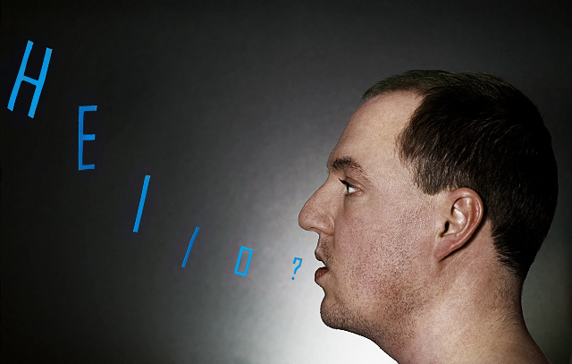
Composition: The composition is good but I feel you are a little close to the right side for comfort. I also wonder if the way the letters curve up to the top of the frame isn't causing an unnatural line in the image - I say this because my eye is drawn from you out to the "H", which is taking me away from the model.
Technicals: The lighting is good, maybe the backlighting could be a bit higher. The PP work is very good.
Feel: I wish the letters were a bit more "professional" looking as they seem to drop the tone of the image a bit. If I had voted I think that fact would have dropped a point and maybe a lot of other voters felt similar? Overall a pleasant image and as a portrait would work very well. Your creative streak, whcih you should continue to foster, may have in this case not added to the overall image :(
PM me if you have any querstions. |






 Add photograph to your favorites
 Add photographer to your favorites

 Photographer found comment helpful.


