You don't need me to tell you this is a fine color portrait, you already know that. You are someone who knows what they are doing and does not need me to tell you what is good or what is not. I'd be torqued if this were my image and it scored so low.
Positives:
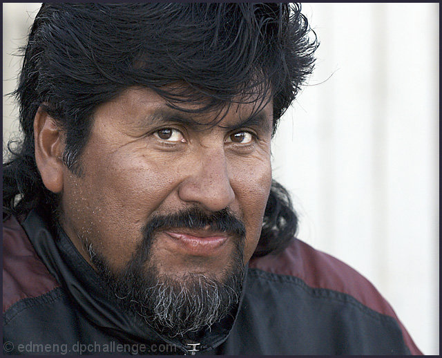
Strong technicals... focus, lighting, perspective and the use of the offset framing are all well applied. Sharpness is very good. You have applied good current photographic environmental portraiture technique that flatters your subject. I'm certain if you were doing this as a sitting for a client this would be well accepted, even by an artist and they are sensitive.
Technicals:
Decent overall technicals. Some might say the face is harsh and focus slightly oversharpened, etc. Personally, I think they would be wrong. There is little about your presentation that is unflattering to your subject. You've likely captured him well.
If anything the brightness is slightly below normal, but not much. Even with that it probably fits the image.
The challenge:
I'm sure there would be no end of voters who would suggest, "You got over 5.6, what more do you want?", as if 5.6 is a good score. It isn't. I don't care, I would not be satisfied by that score with this image if it were mine nor do I think you should be either.
Suggestions:
You could increase brightness and add vignetting to highlight the subject against the existing background but that is about all. This is a good image as it is. |