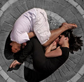
an elegantly stylish image; especially like the use of the desaturation which i find to be very effective. has something very cover of a book thing about it - would probably be a fairly successful stock photo. only slight reservation is that it feels a tad too tightly cropped, and might have in fact benefitted from a black frame. and also not sure if it really says "circle" prominently enough. Otherwise very likeable though.
My New Scoring System ™; composition + technical 2/3, challenge 0.5/1, post processing results 2/2, ooooh factor 2.5/3, originality 0.5/1 = 7.5 (or 8) |






 Add photograph to your favorites
 Add photographer to your favorites


 Photographer found comment helpful.


