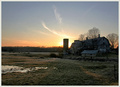
Works well for this challenge, though were it advanced, I'd have toned down the noise in the sky just a bit. I do like the yellow tint - adds to the "aged" appearance of the shot overall. Quite a lovely old structure despite it's somewhat rundown appearance, isn't it?
I agree with Julianne, maybe tone down a little bit the yellow? the noise works perfectly here though, and a very nice angle you chose, it really helps to create depth.
Bob,
I wondered if this one was yours when I was voting - I am starting to recognize your style. I really like the sepia/yellow toning on it, and think it was an excellent choice for this challenge. I would like to see a little more negative space in the sky, but realize a different crop might be impossible given the location. Good entry! And look at that score from your commenters!
When my husband sees a house like that he always says "Has my name on it. Slap on a little paint and move right in." The grain really adds to the run-down condition of the old house. I gave it a 7 because I didn't like the yellow tone. It was a little too strong, and didn't seem right on the roof.
grain gives aged feel. not too sure about hue used but toning works. I'm just waiting for something to happen. There is tension here - you know, it might be due tot he use of yellow. gotta think on this one a while.







 Add photograph to your favorites
 Add photographer to your favorites

 Photographer found comment helpful.


