Greetings from the Critique Club!
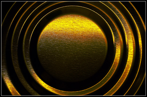
I like that you cropped this so tight that I can pretend it's not just a can lid. I don't like symmetry, but the symmetry here is undercut by the light acting differently on one side than it does on another. It looks like the light is coming in on a bit of a diagonal. I also like the scratchy texture. Maybe that's what the eyecandy-craving dpc voters voted you down for? Because I'm not sure why you didn't score higher.
I would have called it "Tin Sunrise" because it has a landscape quality to it. I don't have any suggestion to improve this. It is what it is. |







 Add photograph to your favorites
 Add photographer to your favorites

 Photographer found comment helpful.


