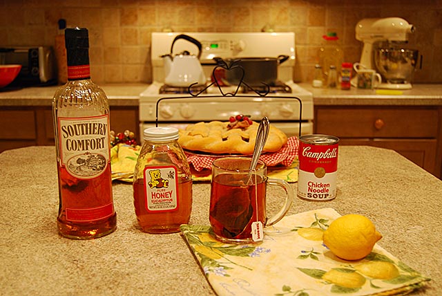
I really like the idea here. However, seeing the items in the background are really distracting. Also, I think a bit stronger comp would have really give this image a strong edge. Lastly white balance is a bit yellow.
a little too much (light bulb-)yellow. play with aperture to blurr the uneven, distracting background. I like the similar colors of bottle, honey, tin and cup.
Interesting idea, but the composition doesn't work as well as it could. Just lining things up like that leaves the image dimensionless. I would've moved the pie & pie-caddy off to one side and rotated the handle about 45-degrees, the taller items (especially the Southern Comfort bottle) should be moved to the back of the line-up -- or, even, to a less "obvious" spot like on the rear counter for the viewer to "discover". Finally, what it the purpose of the napkins or dish-towels (under the lemon and the pie)???? Perhaps they could be removed altogether. I do like the lighting, although because it is incandescent, it is a bit "yellow"
This could use more blue because the lighting here is very orange. The depth of field could be a bit shallower so that the background doesn't destract so much.






 Add photograph to your favorites
 Add photographer to your favorites


 Photographer found comment helpful.


