Greetings from the Critique Club
by strangeghost
The first three parts of this critique are written based purely on examination of your photo. "Final thoughts" is written after reviewing your score, photographer's comments, and voter comments.
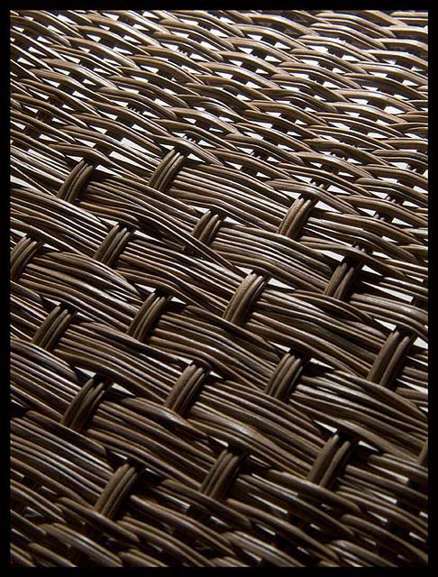
TECHNIQUE
The lighting levels look a little uneven due to the light background appearing through the slats everywhere, especially at the top. Sharpness, focus, depth, all look pretty good. In spite of the fact that it's well focused, it is not an easy image to look at. I know that's pretty subjective, but I can't do much better at the moment. More below.
COMPOSITION
You've chosen an oblique angle to add some interest with lines and angles. Does it work? Yes, to a degree. The colors are bland, and the contrast created by the midtones of the wicker and the light background seem to clash a bit to me. I can't really put my finger on what seems wrong here, but maybe the lack of a clear subject is close to the point. Perhaps if you had gotten closer and created a dramatic and detailed view of a section of wicker, and then let the "landscape" trail off into the distance (but keeping everything in focus) it might have been stronger. As shot, There's nothing to draw my eye or my interest, and the bland colorscape doesn't really invite the eye to explore. If this is a chair, perhaps choosing an area with contour changes would have added some drama.
EMOTIONAL IMPACT
Not much, I'm afraid. It's a decent study of an interesting texture, but it seems to be lacking pizzazz or wow. An unusual shot, technically adequate, but ultimately not very effective.
FINAL THOUGHTS
Well, your voters and commenters were generous. Your final score of 5.5 isn't bad, I might have predicted just a bit lower. People commented on the technicals (as did I) and the fact that it has an abstract quality to it (it does). Good job overall. I enjoyed studying this image for critique. |