| Author | Thread |
|
|
03/17/2007 07:36:10 AM |
|
 Photographer found comment helpful. Photographer found comment helpful. |
Comments Made During the Challenge  |
|
|
03/13/2007 12:43:47 PM |
|
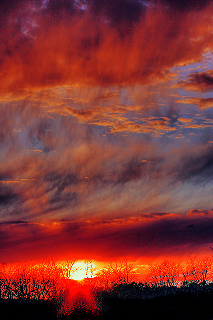
i think you might have overdone the red enhancing postwork to try to fit what looks like a great image into a "Red" challenge... |
|
| Photographer found comment helpful. |
|
|
03/12/2007 05:39:08 PM |
|
Beautiful! maybe a little over saturated but I really like the layers of color. |
|
| Photographer found comment helpful. |
|
|
03/11/2007 04:28:31 PM |
|
it's overdone, the colors look fake |
|
| Photographer found comment helpful. |
|
|
03/09/2007 10:57:25 PM |
|
The top half of the image with the sky is great, but the bottom has way too much red hue... |
|
| Photographer found comment helpful. |
|
|
03/09/2007 01:40:00 PM |
|
I was very excited about this shot until I scrolled down. The clouds are beautiful and perfectly exposed. Unfortunately, the sun seriously detracts from the shot as it's overpoweringly bright and overexposed. I can certainly see that you would want something in the foreground to add interest, I think that, ultimately, you would have done better to crop it. |
|
| Photographer found comment helpful. |
|
|
03/09/2007 12:03:15 PM |
|
a bit heavy handed on the processing |
|
| Photographer found comment helpful. |
|
|
03/09/2007 12:31:52 AM |
|
It seems over post edited to me... JMHO |
|
| Photographer found comment helpful. |
|
|
03/08/2007 01:43:22 PM |
I absolutely love the top 2/3 of this image. The clouds are awesome.
The bottom 1/3 looks like you over sharpened and contrasted it. |
|
| Photographer found comment helpful. |
|
|
03/08/2007 10:39:29 AM |
|
seems a bit over procesed |
|
| Photographer found comment helpful. |
|
|
03/08/2007 04:19:59 AM |
|
upper two thirds look really good, but lower third is extremely overprocessed |
|
| Photographer found comment helpful. |
|
|
03/07/2007 10:50:49 AM |
|
Seems like the increase of contrast or maybe saturation blew out the horizon line, giving an almost "posterized" feeling. The top 2/3rd's of the photo is nice, lower 1/3 is distracting. |
|
| Photographer found comment helpful. |
|
|
03/07/2007 10:48:07 AM |
|
| Photographer found comment helpful. |
|
|
03/07/2007 07:27:17 AM |
|
Very cool. Like the red tint to the sky. Very good touch on a very good pic 10 +++ |
|
| Photographer found comment helpful. |
Home -
Challenges -
Community -
League -
Photos -
Cameras -
Lenses -
Learn -
Help -
Terms of Use -
Privacy -
Top ^
DPChallenge, and website content and design, Copyright © 2001-2026 Challenging Technologies, LLC.
All digital photo copyrights belong to the photographers and may not be used without permission.
Current Server Time: 06/29/2026 06:48:48 AM EDT.