| Author | Thread |
|
|
09/11/2007 09:17:01 PM |
|
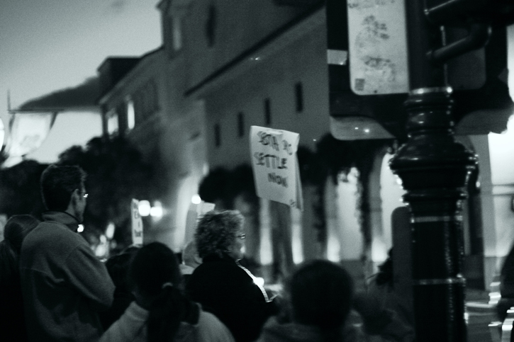
I like the people in the crowd, but the sign feels too centered. I wonder how it'd look with the right edge cropped in just to the right of the sign. I think that'd put the focus more on the people and less on the pole and stuff to the right. |
|
 Photographer found comment helpful. Photographer found comment helpful. |
|
|
08/05/2007 11:08:15 PM |
|
I really like this one. There is enough contrast to really make it pop. |
|
| Photographer found comment helpful. |
|
|
08/05/2007 09:00:18 PM |
|
The cool tones of this actually feels cold! Nice work! |
|
| Photographer found comment helpful. |
|
|
08/05/2007 08:57:05 PM |
|
I like this one also. There is more atmosphere and the color treatment I really like. Nice. |
|
| Photographer found comment helpful. |
|
|
08/05/2007 08:43:16 PM |
|
Of the two I like this one much better! Maybe because I can read the sign I understand what is going on, which I don't really get a feel of in the other shot. |
|
| Photographer found comment helpful. |
Home -
Challenges -
Community -
League -
Photos -
Cameras -
Lenses -
Learn -
Help -
Terms of Use -
Privacy -
Top ^
DPChallenge, and website content and design, Copyright © 2001-2026 Challenging Technologies, LLC.
All digital photo copyrights belong to the photographers and may not be used without permission.
Current Server Time: 07/20/2026 12:27:19 AM EDT.