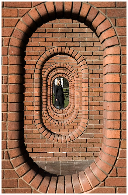
This is an overlay of two different RAW conversions of the same capture generated in Lightroom. A normal conversion for the bricks, and a seriously pulled version for the girl and the background to avoid them being blown out.
After that levels on the bricks to spruce them up with a slight desat to stop them looking too artificial. Shadows/highlights and some levels on the girl to make her a bit more 3-dimensional and levels on the background to dull it down.
Flatten, resize, sharpen, border, save for web.
Statistics
Place: 211 out of 624 Avg (all users): 5.8538 Avg (commenters): 6.5556 Avg (participants): 5.7388 Avg (non-participants): 6.2703 Views since voting: 976 Views during voting: 305 Votes: 171 Comments: 11 Favorites: 0
Love th idea - Would love to play with those - Could be many opportunities in there. Maybe getting the person to stand in the ring would have blocked out those white signs in the back that compete with the head of the girl too much. I think we should be seeing more of this place in future pics - It's great.
Wow too cool of a shot, great idea and great eye for picking this out. I am sure most would just walk by, but you did a great job capturing this. Nice work.
Cool shot. My eye was immediately drawn, however, to the fact that you are slightly off center -- slightly to the left (not the model, the photographer). I mean, on the second brick wall, you have 1.5 brick lengths on the right and less than 1 on the left. This is carried on to the third wall. Maybe this was your intent. Maybe I am too left brained and demanding of order and symmetry. But it jumps out at me.
This is a really nice concept. Looks like some good light. The only suggestion I have is that I'd move her up a couple of places so that we can get a better look at her.







 Add photograph to your favorites
 Add photographer to your favorites


 Photographer found comment helpful.


