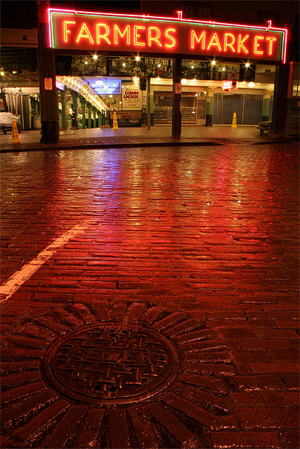
I cloned out a red clock in upper right corner as only a small part of it was in the image and distracting. Then: exposure, curves, flatten, USM. I should have checked my ISO before taking this. I would have reset it to ISO 100-400 if I were to do it over again. Also, I had to watch behind me because I had to set up in the street to get the foreground I wanted and delivery trucks start arriving at this time of morning.
Statistics
Place: 108 out of 201 Avg (all users): 5.4825 Avg (commenters): 5.8571 Avg (participants): 5.0923 Avg (non-participants): 5.8077 Views since voting: 862 Views during voting: 230 Votes: 143 Comments: 9 Favorites: 0
How are you doing today? I am going to touch on a few items with your image.
Colour;
I really enjoy the colours here. The balance of the reds within the transition as well as the white lights creates a strong form. Along with the bits of yellow, blue, green inside gives the wandering eye something else to look at.
DOF/Focus;
I like the focus here, being have to see the wet brick is very important for this image I believe. Being wet adds a unique element. The sign itself, it is hard to determine if it is in focus or slightly off because it is neon. Overall this image holds strong focus for me.
Post;
I don't miss the clock so it was a good call to remove it, and it appears you have a good feel for the exposure/curves/usm you applied. The image does not seem blown out or overly dark in any areas and most important the image is not flat either.
Off Items;
I really enjoy this perspective, however, the tilting of the sign throws me. I understand you had to shoot at an angle to get the manhole and the sign, However, Maybe a stronger rotation of the camera to make the sign even more angled. For me it just throws me a bit. Also, because the smaller signs are straight.
Other;
As I continue to look through this image, I really enjoy the vanishing point created with the green pillars and light. I am thinking if you cropped it off on the outside edge of the outside pillar (getting rid of that yellow cone on the far left) and changing perspective of the sign to make it straight horizontal this image would have a much more dramatic appeal.
A very nice image and very fun concept for the challenge. And well, it also makes me miss Wa. a bit.
I really like the overall tone. Great reflections. Love your composition and DOF. I wished the white stripe wasn't on the bricks. The foreground bricks in circular pattern (man hole?) really keeps your eye in the photo and gives it balance. Thanks for the great shot.






 Add photograph to your favorites
 Add photographer to your favorites

 Photographer found comment helpful.


