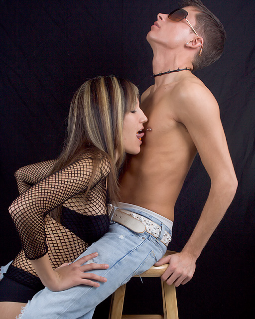
Many thanks to my models Megan and Tony. It was a great time at this shoot. This basicly as it was right from the camera.
Shot in Raw adjusted WB and expouse abit.
Cropped for abit better comp.
ran Noise Ninja.
Resized.
USM.
Saved for web.
Statistics
Place: 80 out of 232 Avg (all users): 5.4480 Avg (commenters): 6.0714 Avg (participants): 4.8594 Avg (non-participants): 5.6879 Views since voting: 1901 Views during voting: 848 Votes: 221 Comments: 18 Favorites: 5 (view)
Composition: Oh yeah....now this is my kind of image. I love this job...lol!! Okies....lets behave and get down to business. This image is great. It has a strong diagonal with activity in both sides of that diagonal. The males head I feel is a little too close to the top....it gives a very cramped feeling....entrapment...which, yeah, he is experiencing a feeling of being trapped...but one of enjoyment. So the close crop at the top is contradicting of the images feeling. I would've liked to have seen that visible part of 'his' right leg removed, but I am aware that this is a basic editing, so maybe that is something you can watch for in future shoots. Also her orange tongue bar is distracting and cumbersome. Maybe a silver one or remove it for this angle shot would have been better.
Technical: ) The lighting over the models is superb. Nothing to be said there. However the indifference in the lighting on the backdrop is messy. It shows the creases on the right side behind the male. This keeps drawing the viewers eye out of the scene.
Overall: Okay...taking into account the backdrop lighting and the small details in the composition, I feel this image was hammered due to what I call the 'nudie police'. I feel for you as I experience just as much as anyone on this site. It is a shame...but please do not let that deter you from experimenting with this line of work more. I would love to see your future shoots. If you have any questions or I can help you in any way please do not hesitate to PM me. Good luck...oh and I hope you don't mind...but I am adding this to my faves.
The background I find alittle distracting and abit noisy, you could try a couple of things. One would be in the set up and have a few more feet between your subjects and the background this will put less light on the background and will be naturally darker, and if you use a shallow DoF you will not notice the wrinkles in the background. Second thing you can do if you don't have more room is if you are working with curves take the slider where the shadows begin in the corner and slide it towards the middle the background will soom go dark, you can then click somehwere on the skin and it should show you where it is on the line and you can lighten that area.
this is one of he best in a mixed bag I like the composition and placing of the actors, maybe the background could drop a coule of tones to become truly black 10






 Add photograph to your favorites
 Add photographer to your favorites

 Photographer found comment helpful.


