| Author | Thread |
|
|
03/03/2007 06:05:12 PM |
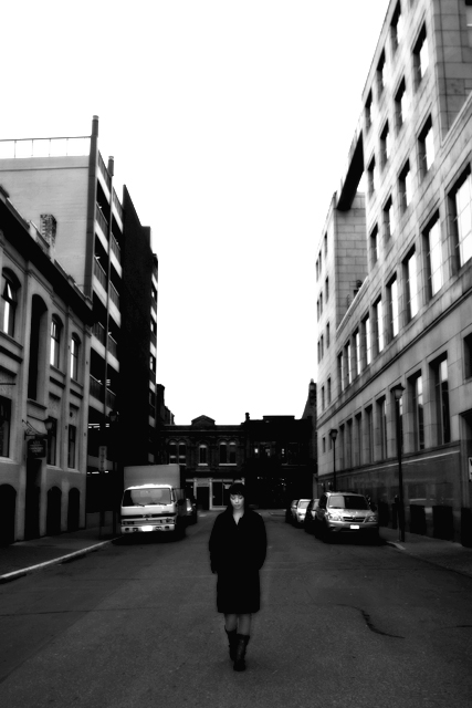
greetings from the CC. Well, this is not my kind of image really, but that being said I really like the girl and her pose I really like the composition and her so centrally located. Definitely a black and white image called for here adds mood. Color would have been really boring.
I like that she IS the focus as well she should be. I do not like the sky. It is just way too far gone and overexposed. And while the height makes her look small there is just too much info/detail gone in the sky.
I also do not like that the buildings are falling in on her, being advanced editing I would of straightened the buildings.
I hope that helps, overall well done.
Hey I see here this is in Victoria, cool, I am in vancouver. |
|
 Photographer found comment helpful. Photographer found comment helpful. |
|
|
03/01/2007 01:35:25 PM |
The technicals: I think your PP lets this shot down. Why the gaussian blur? If it was an attempt at noise reduction, I think you went overboard. If it was an attempt at an "effect", I think it hurt the shot. As far as other aspects, your GF's coat gets lost somewhat in the street.
The feel: Street photography should do one of a few things: 1) capture the human condition either through an interesting scene or through the facial expressions captured in an everyday occurance. 2) capture nostalgia 3) capture an interesting geometric pattern (meaning the photo has abstract qualitites) which rises above the photo as a whole. I'm not sure your shot does any of these too well. I did not see this one in voting, but I would have sensed "set up" immediately. That's not good for this challenge. The subject's face is also too small for us to get a feel about.
The game: B&W was a good choice for this challenge. Setting up the shot wasn't. |
|
| Photographer found comment helpful. |
Comments Made During the Challenge  |
|
|
02/24/2007 12:07:28 AM |
|
wow that processing makes the city seem almost sterile...or else reyhjavik is just spotless ;) very cool photo. i wouldn't call it street photography as suggested in the challenge description, but i'm guessing that doesn't matter if know how to appeal to voters in a street photography challenge. |
|
| Photographer found comment helpful. |
|
|
02/23/2007 10:02:29 PM |
|
Although the subject is very dark, the tone suits her. |
|
| Photographer found comment helpful. |
|
|
02/21/2007 01:55:41 PM |
|
In my opinion the subject is just too blurry. I expect that was intentional, and sometimes I do like the effect, but here it doesn't work for me. Hope you will find this comment to be helpful. |
|
| Photographer found comment helpful. |
|
|
02/21/2007 08:40:20 AM |
|
really like the composition on this one. I think the girl needs to be a bit closer or sharper, she's not quite a strong enough element in the shot in my opinion. Still really like the shot though, good work |
|
| Photographer found comment helpful. |
|
|
02/20/2007 01:36:50 PM |
|
showing up quite dark, difficult to see detail |
|
| Photographer found comment helpful. |
|
|
02/20/2007 11:24:41 AM |
|
Very nice shot, great contrast. |
|
| Photographer found comment helpful. |
|
|
02/20/2007 04:36:46 AM |
too posed but a a good photograph none the less.
6 |
|
| Photographer found comment helpful. |
|
|
02/20/2007 03:42:46 AM |
|
I like this a lot, it looks very modern, perhaps not exactly what was asked of the challenge description, but still very good! (8) |
|
| Photographer found comment helpful. |
|
|
02/19/2007 07:20:22 PM |
|
oof and a little overprocessed. looks setup too, not really what the challenge is supposed to be about |
|
|
|
02/19/2007 05:07:11 PM |
|
This picture seems to be out of focus. |
|
|
|
02/19/2007 11:14:16 AM |
|
| Photographer found comment helpful. |
Home -
Challenges -
Community -
League -
Photos -
Cameras -
Lenses -
Learn -
Help -
Terms of Use -
Privacy -
Top ^
DPChallenge, and website content and design, Copyright © 2001-2026 Challenging Technologies, LLC.
All digital photo copyrights belong to the photographers and may not be used without permission.
Current Server Time: 06/30/2026 10:52:23 PM EDT.