Shadows & Highlights
Exposure
B & W: 2 Hue/Sat. layers and Gradient adjustment layer
Levels
Reduce size, add border, save for web
________________________________
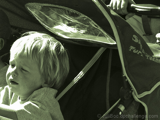
I removed the greenish tone that was hated by most voters. I think my monitor doesn't show the green as strongly as some, because I could hardly tell it was green. But I do like this version better. Thanks everyone for your comments.
Statistics
Place: 276 out of 288 Avg (all users): 4.3909 Avg (commenters): 4.8750 Avg (participants): 4.1696 Avg (non-participants): 4.6204 Views since voting: 838 Views during voting: 323 Votes: 220 Comments: 12 Favorites: 0
I think P&S cameras use a 4x3 or 5x7 format in general. I think the same photo with a typically 4x6 DSLR format might have even worked better.
Thanks for your comment Jason. I am going to see if there is a way I can change the aspect ratio of my shots to 4x6. I have been frustrated several times by the 4x3 format that I am currently using.
An interesting photo. It is one of those types of photos that I think would work best in a series rather than alone. It kind of grows on you the more you look at it. One think I might suggest it burning out the ear/face of the "other" child, since it does not add anything to the photo. While I don't mind the "green" tinted one I do prefer the straight B&W you have converted.
A side note: I think P&S cameras use a 4x3 or 5x7 format in general. I think the same photo with a typically 4x6 DSLR format might have even worked better, starting with the same point on the left. I would have loved to see a bit more of that handle bar. Nothing to do about that one, just a last minute notion.
A terrific photo that I think was befitting of a higher rating in the challenge.
This is an interesting choice of subjects, but I feel that your execution is a bit lacking. Composing this one with the child so close to the frame edge that he is facing gives a very uncomfortable, cramped feeling to the image. You also lost a good deal of detail in his hair where your blow highlight is. Softer light of a different time of day would have helped out a great deal. I'm also not too wild about the green toning that you added. With some work, this one could have been much better.
Well, sorry to be telling you that this one doesn't work for me, so I hope you won't mind if I explain my reasons. The subject's expression isn't something I want to view... he just looks upset, but there is no context as to why (with kids sometimes a reason isn't necessary, I know :) Also his placement in the frame, almost out of the frame actually, isn't the best. And finally the exposure is poor (his forehead and blond hair with no detail in the highlights, for example) and the b/w conversion seems flat. Don't mean to be ultra-critical as this may sound, but it's how it strikes me, and I hope you'll find my comment helpful. Best to you, Ray
i would have called it "little angle", as that platic thing looks like a halo. left wondering why the hand won out in the composition over his brother.





 Add photograph to your favorites
 Add photographer to your favorites


 Photographer found comment helpful.


