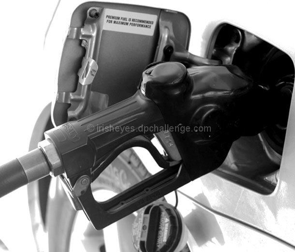
I hate filling out too. The lighting seems harsh which is killing the contrast (at least on my monitor). Great idea. I also would like to see more DOF with the cap, and text in focus also. 6
I don't get the relation with 'hate'. Furthermore teh composition is not very appealing, the crop is very narrow above, whites are blown out and I think the DOF should have been slightly deeper. All in all not a very pretty picture to be honest. (3)





 Add photograph to your favorites
 Add photographer to your favorites


 Photographer found comment helpful.


