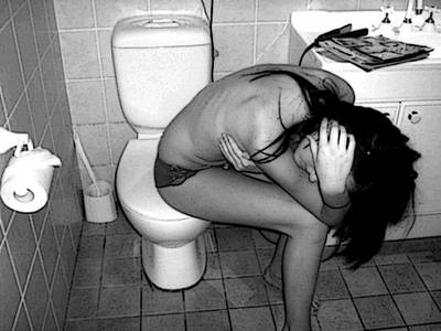
I took this photo after i read an article on celebrities with eating disorders. It inspired me to capture the influence celebrities have on young people.
Statistics
Place: 77 out of 132 Avg (all users): 5.1513 Avg (commenters): 5.7500 Avg (participants): 4.7800 Avg (non-participants): 5.2500 Views since voting: 1070 Views during voting: 772 Votes: 238 Comments: 18 Favorites: 1 (view)
Greetings from the Critique Club. The following comments are in response to your request for a critique on your challenge submission. Please feel free to send me a PM concerning my comments.
An interesting an emotive image, this requires the viewer to pause and try to get the story because of its subject matter. The choice of Black and White helps limit the subject to the young woman and her surroundings. The title with the subject of the challenge, however, carries much of the meaning. Without the title it would be difficult, I think, to understand the concept of self-hate because of an eating disorder. Nonetheless, the story is there.
I like the pose of the woman with her identity obscured by the hand over her face. The ribs showing on her back and the thin body contribute to the message being presented. The composition seems casual in the arrangement of elements but makes the setting definitely a close bathroom in which the subject seems trapped. I don't understand, however, the inclusion of the items on the vanity--the hair straightener(?) and papers seem to take away from the idea that her only reason for being in the bathroom is her illness. I find the angle of the camera interesting, too, that the lines of the room are a bit off kilter enhancing the idea that the subject is not feeling quite right.
Technically it's not a bad image. I enjoy seeing a full range of tones from black to white. But there are some over-exposed whites in the toiletpaper and on the sink...perhaps from a strong flash? If it is flash, then bouncing or diffusing the flash could hellp. In my view the "grainy" quality of the image does not detract...but I come from a film background where that was more commonly used to advantage than now where many people (especially at DPChallenge) only wish to see perfectly clean images without noise or grain. I suggest using grain sparingly in challenge entries if your aim is a high score--otherwise I don't see it as an issue.
Overall, I think this image is successful in telling its story.
Keep creating, you've obviously got something to say!
--Kadi
You're gonna get hammered for not using a bigger size but I'm giving it a 7. I think it's an emotive pose. Doesn't necessarily make me think, "hate" but the title helps. I like it.
i like this alot, its very good, the only thing i dont like, is that you can tell shes trying to hide her breast for the picture, it looks like shes grabing it instead of just covering it up even. its bothersome. but besides that i like this picture, and the idea alot. good job.
I really like the idea you were going with here. The one thing that's gonna hurt your score is the image size. 640 pixels on the longest side is the standard for submsisions. You've done a great job conveying your message with the photo, and I wish you luck in the challenge.






 Add photograph to your favorites
 Add photographer to your favorites


