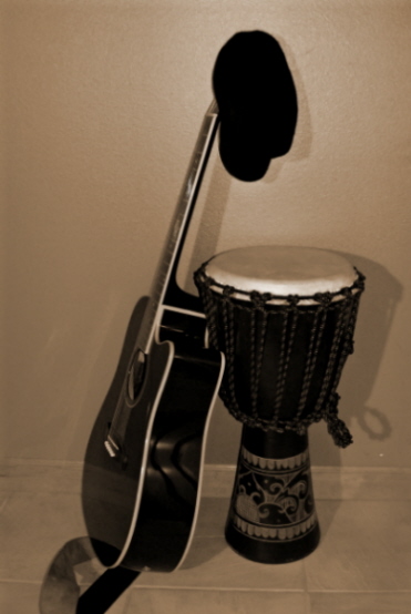
took this shot in my studio (which is unfortunately my bathroom). used one over head light, and one of those bendy desk lamps. the origional pic was a lot darker. in editing i turned up the adaptive lighting, contrast and sharpness. i then converted to black and white, tinkered with the coloring controls, and turned to sepia. i did all editing on "HP Image Zone". the entire idea was to get a beatniky feeling, and i hope that i did just that...
Statistics
Place: 175 out of 183 Avg (all users): 3.9577 Avg (commenters): 3.3333 Avg (participants): 3.8269 Avg (non-participants): 4.0073 Views since voting: 738 Views during voting: 246 Votes: 189 Comments: 11 Favorites: 0
ok, after getting comments, trying to fix the origional, and being absolutely disgusted with the picture myself, i have come to two conclusions. the first one is that this was my worst picture yet and it should be scrapped. the second conclusion i came to, is that if i had to do it over again, and i probably will someday, i'll add more light, add a black backdrop, and do very different things in my editing process. the lights would at least either have to come from both sides, or be stronger and wider. having the black backdrop would allow me to experiment with colors and spotlighting. (textured walls seem to get every color of the rainbow inside pics, which isn't good if you want to turn up or down the saturation of certain colors). also, the editing would be done in Adobe Photoshop, giving me more options for black and white, sepia, noise, and last, but definitely not least, sharpness. well, that's all i have to say about this piece of trash. sorry if it burned your eyes! ;p
The set up of the photo is pretty good - especially the drum and hat. But, this image seems a little fuzzy and the lighting with the sharp shadows is not very flattering to the cool drum. I woudl love to see more detail on the drum - sharpening and improved light might help out.






 Add photograph to your favorites
 Add photographer to your favorites


 Photographer found comment helpful.


