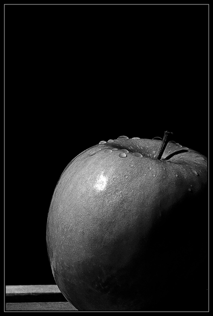
I debated heavily whether I wanted to submit the color version or the black & white and ultimately decided that I found this version more compelling.
Not much to tell about this one, 'cept that it is almost exactly what I saw in my mind's eye before I started - I'm happy that I accomplished that. I had several takes of this where I set the exposure to 15 seconds, manually fired my flash high & to the left then walked around & fired it again low and behind. On a few shots - like this one - my poor old flash couldn't summon a second fire! That was fine by me, I wanted a couple of high contrast shots with just a single light source anyway...
Statistics
Place: 114 out of 346 Avg (all users): 5.7857 Avg (commenters): 6.0000 Avg (participants): 5.6827 Avg (non-participants): 5.9531 Views since voting: 1069 Views during voting: 225 Votes: 168 Comments: 7 Favorites: 1 (view)
First off, I love the details of the water beads on the top of the apple. The main critique I have here is lighting. Half of the apple is lost to shadow. I know that it gives it a dramatic look as the apple seems to emerge from the darkness - but that dramatic punch is lost without color. A burst of red or green emerging from the darkness has alot more visual impact and is noticed more than the study in B&W tones. If you go with the B&W tones the object needs to have interesting texture or the cropping needs to add to the dramatic presentation. Texture - the surface of a granny smith is basically one color you could spice up the B&W if you went with a different apple - such as a two-tone apple (Gala apples, Jona Gold or even Ambrosia apples). The 'texture' is introduced in the shifting tones which would increase the dramatic look in a B&W study. If you stay with the granny-smith apple then a another simple way to increase the visual appeal is to crop it closer to your main object. Cutting out much of the negative space by utilizing a square crop that is close to the apple would help. You could balance the level of shadow on the bottom of your apple to match closely with the negative space of the background so that in a square composition we just see this apple 'emerging' from the shadows.
Nice monochrome however you do loose quite a bit of detail in the shadow. If this in intentional - I think it works generally for low-key, but not so much here - if it's my monitor, sorry!
Compositiion and lighting are strong and the touch of the droplets set it off.







 Add photograph to your favorites
 Add photographer to your favorites


 Photographer found comment helpful.


