| Author | Thread |
Comments Made During the Challenge  |
|
|
02/13/2007 09:26:29 PM |
|
|
|
02/12/2007 06:25:39 PM |
|
Although the colors are nice, the angle at which you shot this makes it seem sort of fake. |
|
|
|
02/10/2007 11:30:58 PM |
|
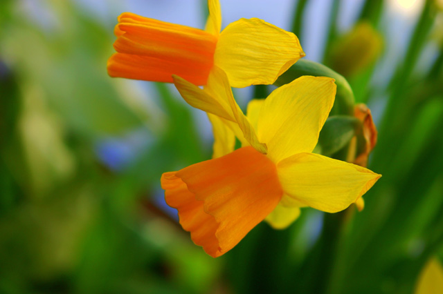
maybe in a flower/plant category |
|
|
|
02/10/2007 08:39:57 PM |
|
I like the vibrent colors here off set against the otherwise green background that it grows in. The depth of field choice is also very effective here. Nicely done! |
|
|
|
02/10/2007 08:49:44 AM |
|
For this to POP, the flower needs to be better in focus. |
|
|
|
02/09/2007 06:04:28 PM |
|
the focus isn't quite there...nice colours however |
|
|
|
02/09/2007 03:35:39 PM |
|
|
|
02/09/2007 02:37:57 PM |
|
|
|
02/09/2007 11:12:21 AM |
|
Very fresh looking. I love the colors in this picture, as well as the central focus of the flower in this image. Beautiful work. |
|
|
|
02/08/2007 07:13:34 PM |
|
Lovely color and focus. The crop is too tight at the top, cutting off part of that flower. |
|
|
|
02/08/2007 11:46:47 AM |
|
This is pretty. Good job! |
|
|
|
02/08/2007 11:20:15 AM |
|
I love the bright colors, it adds a lot of emphasis. |
|
|
|
02/07/2007 10:39:55 PM |
|
|
|
02/07/2007 04:23:08 PM |
|
|
|
02/07/2007 02:52:45 AM |
|
The colours are nice, and I like the andle of light, but I also think that some deeper shadows would have helped to show some texture and detail. The composition looks a bit out of balance - me wanting to see a bit more on the top and not wanting the space on left and bottom, mainly just wanting to see a bit more at the top. |
|
Home -
Challenges -
Community -
League -
Photos -
Cameras -
Lenses -
Learn -
Help -
Terms of Use -
Privacy -
Top ^
DPChallenge, and website content and design, Copyright © 2001-2026 Challenging Technologies, LLC.
All digital photo copyrights belong to the photographers and may not be used without permission.
Current Server Time: 06/29/2026 08:36:27 AM EDT.