| Author | Thread |
|
|
11/26/2003 12:03:19 AM |
Hello from the Critique Club!
I think this is an excellent photograph. I do agree with some of the commenters that the title isn't exactly right and so it misses a slight bit of the challenge requirements, however I don't think it is really that HUGE of a mistake. The important part right now is the aspects of the photo so I'll dig right in:
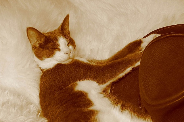
The first thing that strikes me is the color. It seems like a sepia tone, but perhaps exaggerated? The richness of the color is just amazing which is why I wonder about that. I think it really works well for this photo, it doesn't give it an antiquing look like most sepias do, but instead it gives both a unique feel and also highlights my next observation:
The texture of this photo is fantastic. You have really managed to capture the fluffiness of the fur on both the cat and the throw? it is laying on. The contrast between those and the hat also shows very well in this photo - excellent work.
The lighting looks to be lowish, which gives the photo and intimate feel, that cat looks like it can't be bothered for the world and that feeling is projected splendidly.
The focus is perfect, I can easily see the fur and its texture and yet there is an overall softness to the photo that I don't think is brought out by the 'props' alone.
Composition is great, I like how the focal point grows out of the bottom corner and isn't just plopped in the center of the image. I also like how most of the color follows that line as well with the nice natural white background created by the fur throw thingie.
I think the only thing I would suggest in the future is slightly more light, I do like the intimate air about the photo but I think the contrast of the colors might pop just a bit more if the whole image was lighter - not in color or tone but just more lit up. Not too much though because losing that intimate feel would be a tragedy.
I think this is an excellent image and you've done yourself proud. Had it fit the title exactly (ie had the correct title of the book) I think it would have done a bit better, but I also think it deserved a higher score than it got. Very well planned and executed. |
|
Comments Made During the Challenge  |
|
|
11/18/2003 11:57:17 PM |
|
I like the sepia tones and the fuzzy background, gives a warm feeling to this shot. Nicely done. 9 |
|
 Photographer found comment helpful. Photographer found comment helpful. |
|
|
11/18/2003 09:49:21 PM |
|
EXCELLENT take on the challenge. Love the colors and the textures, her coat is so close to that cloth! My favorite so far! 10 for sure |
|
| Photographer found comment helpful. |
|
|
11/18/2003 03:12:47 PM |
|
Love the idea and very good. |
|
| Photographer found comment helpful. |
|
|
11/17/2003 07:15:16 PM |
thats a pretty cute cat that youve got there...
nice picture, ad nice choice with the sepia that you used, i think thats what it is!...?
good job! |
|
| Photographer found comment helpful. |
|
|
11/16/2003 02:53:27 PM |
|
This is an actually good cat picture - nice textures. |
|
| Photographer found comment helpful. |
|
|
11/14/2003 08:49:28 PM |
|
Rusty should get some extra iams tonight. good kitty rusty! meow! |
|
| Photographer found comment helpful. |
|
|
11/13/2003 07:08:19 PM |
|
Doesn't quite fit the book title (The Cat in the Hat), but it's a pretty good shot. |
|
| Photographer found comment helpful. |
|
|
11/13/2003 10:56:59 AM |
|
cat IN the hat. Good use of sepia though. |
|
| Photographer found comment helpful. |
|
|
11/13/2003 06:16:44 AM |
|
How cute. The colours are so similar (wow). I love it! |
|
| Photographer found comment helpful. |
|
|
11/13/2003 01:29:05 AM |
|
i wonder how strange this would look if it was red and white instead. haha. the cat looks like its in heaven on that furry cushion. hah. |
|
| Photographer found comment helpful. |
|
|
11/12/2003 07:29:35 PM |
|
The real title is The Cat in the Hat... we were supposed to take picture and title it with the title of a book. It is a lovely photo, very well composed, and has nice rich texture. I wish it had really fit the challenge. |
|
| Photographer found comment helpful. |
|
|
11/12/2003 06:36:37 PM |
|
I like the colors. It would have been really neat to have the red and white hat in full color... oh well. My kid (2 years old) is sitting on my lap meowing to your photo. |
|
| Photographer found comment helpful. |
|
|
11/12/2003 03:45:19 PM |
|
the book title is "in" not "n" or "and." had the cat actually been sitting inside the hat, this would have been clever and attractive AND met the challenge. as it is, it's not, and it doesn't. |
|
|
|
11/12/2003 02:18:49 PM |
|
Love the expression of the cat, looks like he enjoying sharpening his claws on the hat lol, I love it, nice to see something relaxing and enjoying life. |
|
| Photographer found comment helpful. |
|
|
11/12/2003 12:48:56 PM |
|
Hummm, third that try this title! But least that do right. I like this composition, so much. It inspires to read the story! Good Job! |
|
| Photographer found comment helpful. |
Home -
Challenges -
Community -
League -
Photos -
Cameras -
Lenses -
Learn -
Help -
Terms of Use -
Privacy -
Top ^
DPChallenge, and website content and design, Copyright © 2001-2026 Challenging Technologies, LLC.
All digital photo copyrights belong to the photographers and may not be used without permission.
Current Server Time: 06/29/2026 01:58:08 AM EDT.