| Author | Thread |
|
|
07/25/2007 08:11:17 PM |
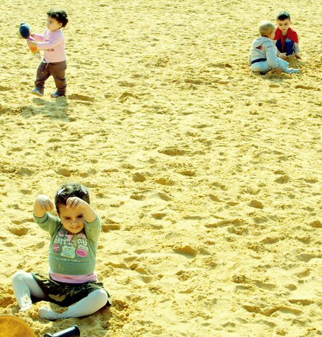
My favorite from your portfolio thus far. It's wonderful how the children get their own corner in the frame. Being Basic I know you couldn't have cloned out the bike section there. I like the slight yellow cast adds a nice character to the shot, but the sand just appears slightly overly bright. I wouldn't mind seeing a version where you apply any PP you want to the shot, and just post it it on imageshack(create a free account). You can then post the link here if you want. If you need any help with that, you can PM or as some folks do post a resized original in the forum and let people have a go at it, see which one you like best and try to get that result yourself :)
Message edited by author 2007-07-25 20:13:37. |
|
|
|
02/15/2007 10:06:32 AM |
Tnx for your comments, Send was not orignally so yellow, it was more kind of rose, to leave it like this was not interesting to me, though may be I should not make such strong contast which brings saturation.
About the weel of bicycle - I should eliminate it somehow.
About the content I'm 100% sure, You can read in description above. For me is not just good it's greate to see children discover and learn about life in sand-box.
Ops, the title should be "Sea of sand".
Natalie
Message edited by author 2007-02-15 10:08:26. |
|
Comments Made During the Challenge  |
|
|
02/13/2007 08:01:10 PM |
|
I like this. it looks like an illustration in a children's magazine. 8 |
|
 Photographer found comment helpful. Photographer found comment helpful. |
|
|
02/13/2007 02:02:04 PM |
|
| Photographer found comment helpful. |
|
|
02/10/2007 04:29:55 PM |
|
great image but i don't get the connection with the theme. |
|
| Photographer found comment helpful. |
|
|
02/10/2007 06:48:35 AM |
|
Interesting composition which breaks a lot of rules, I guess. You'd think one child should be in the lower riht corner, but he's moved to the top right. |
|
| Photographer found comment helpful. |
|
|
02/09/2007 02:29:27 PM |
|
| Photographer found comment helpful. |
|
|
02/08/2007 06:20:20 PM |
|
A little over saturated and/or over brightened. |
|
| Photographer found comment helpful. |
|
|
02/08/2007 05:11:11 PM |
|
Yellow cast? Kids are kinda scattered about without a particular focus, actually all of them are looking out of the picture which tends to leave a bit empty area in the middle making me wonder why shoud I look here? Sorry, only a 4. Jack |
|
| Photographer found comment helpful. |
|
|
02/08/2007 12:06:25 PM |
|
this sand has a really odd color, and i dont kno how it relates too good |
|
| Photographer found comment helpful. |
|
|
02/07/2007 02:36:53 PM |
|
I love the subject - content is great. Technically, the blown-out highlights really take away from this shot; contrast too high perhaps? |
|
| Photographer found comment helpful. |
|
|
02/07/2007 12:39:34 PM |
|
sand is very over exposed ... composition is not very strong (IMHO) |
|
| Photographer found comment helpful. |
|
|
02/07/2007 12:38:17 PM |
|
Wow lotsa yellow color cast. |
|
| Photographer found comment helpful. |
|
|
02/07/2007 12:02:15 PM |
|
Very interesting composition. Sand looks yellow; is that the real color? |
|
| Photographer found comment helpful. |
|
|
02/07/2007 10:52:37 AM |
|
I like the composition quite a lot, the kids playing by themselves and in pairs at the corners of the image. The biggest problem with the image is the colors look a bit oversaturated and yellow. A smaller problem is the bicycle (or whatever it is) in the corner. Maybe you could have taken a step closer to the girl, to be able to crop out the bike. |
|
| Photographer found comment helpful. |
|
|
02/07/2007 10:25:17 AM |
|
| Photographer found comment helpful. |
|
|
02/07/2007 10:03:07 AM |
|
I like the composition, seems a bit heavy on the yellow tones |
|
| Photographer found comment helpful. |
|
|
02/07/2007 03:23:58 AM |
The colors are too yellow. Maybe it was an attempt at artistry. Dunno. I just know the color is not working for me.
I like the three groups of kids, but I would have left a little more space around the edges, especially on the lower left child. |
|
| Photographer found comment helpful. |
Home -
Challenges -
Community -
League -
Photos -
Cameras -
Lenses -
Learn -
Help -
Terms of Use -
Privacy -
Top ^
DPChallenge, and website content and design, Copyright © 2001-2026 Challenging Technologies, LLC.
All digital photo copyrights belong to the photographers and may not be used without permission.
Current Server Time: 06/28/2026 12:43:28 AM EDT.