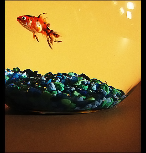
Nice idea, but lighting is kind of harsh and the reflected lights in the bowl are distracting. Seems to be oversharpened and a bit unnatural looking. 6
Right idea. I think this has potential. However there are a few things that are going to pull this shot down overall. 1) The harsh glare from the lights in the upper-right of the fish bowl. 2) Composition - the fish could use a little more room at the top - or - a little less table, to balance this better. 3) Tabletop is a little dirty (hard to see until you load the image on your PC sometimes I know). 4) Odd shaped borders.
All of the above is JMO of course and not meant to be personal. :D Good luck to you in the challenge.





 Add photograph to your favorites
 Add photographer to your favorites

 Photographer found comment helpful.


